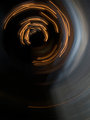
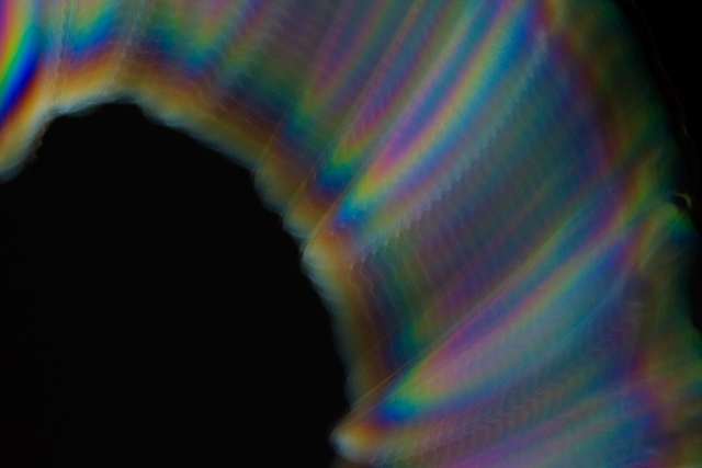
A nice attempt, but the overall feel is flat and dark. There also seems to be no real compositional value to this. Getting the light play to be brighter and the colors to stand out more would be a benefit, and try to remember composition as well. Give the viewer something more to think about than just a seemingly random swath through your frame.
The title, as well, is redundant and unnecessary as identifying what your abstract is is kind of defeating your purpose.
I really do like the picture, but the colors seem very muddy and drab. I know that not all abstracts need bright colors, but I feel this one would be much stronger with them.
Very nice abstract motion. Not quite sure about the cropping, think I would have liked to see a bit more on top and less on the bottom. Nice take though.





 Add photograph to your favorites
 Add photographer to your favorites


 Photographer found comment helpful.


