Welcome to DPChallenge! I see this is your second challenge entry. You have the right idea here, it's a bad habit unless you win! ;)
You got a lot of great comments during the challenge, most of them echoing what I would say.
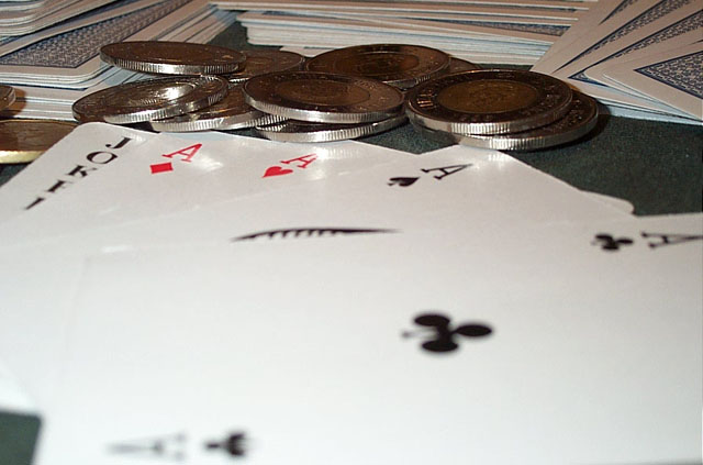
First, try coming from a higher angle or remove the cards in the background but I would like to see a different angle, bringing just the hand the money into the center of attention. The back cards are very distracting.
It's a little bright, maybe tone down the light just a bit or use a reflector to bring the light without the glares.
Other than that, not a bad idea! If you do reshoot this I would love to see the new pictures!
Good Luck In Future Challenges!
Deannda
DNeufer@stny.rr.com if you have any questions or want to discuss this further!
Pretty good, and an Interesting angle. Nice detail. I may have used softer lighting (or not directly light the face up cards) for this environment , something to give that friday night poker feeling. I just seems a little bright (white) to me. Very nice shot.
Hmmm - like the concept, but having trouble with the composition. The Ace of clubs really needs to be in focus because it takes up such a huge portion of the frame. Would suggest smaller apperture and longer exposure.
I also find the lighting very flat, it would be better served with some 'mood' lighting, green table, smoke and low lights. As it is we get the cards and the money, but no atmosphere.
I think the composition may have worked better if the camera was shifted up to remove the white areas of the cards. Lighting seems a little harsh and overexposes parts of the picture. Otherwise nice shot. Canadian toonies, eh? ; )






 Add photograph to your favorites
 Add photographer to your favorites


 Photographer found comment helpful.


