Author Thread Comments Made During the Challenge
Post actions
Interesting shapes and colors ag the white background.
Post actions
Inetersting prespective. The coloring is very pretty.
Post actions
Nice colours, though some of the petals have soft focus.
Post actions
This looks very washed out on my screen, and so I would suggest adding a lot more contrast to this image, and perhaps some burning and dodging.
Post actions
Post actions
Post actions
Post actions
not quite there but a good idea
Post actions
Good idea. I think the arrangement of the petals could be more impactful but good pic anyway.
Post actions
Nice detail in the petals in the background. I think you need more DOF and perhaps more contrast.....it also seems overexposed.
Post actions
Post actions
I like the idea of this but I would have scored it higher had it been either softer or sharper
Post actions
looks a bit plastic, Im not sure if its coz of postprocessing
Post actions
Interesting image and title. Bottom part of the petals is lacking a bit in clarity and focus. Is this really the best photo you have ever taken?
Post actions
Nice, but seems a little washed out. A little contrast in an editing program could help this a lot.
Post actions
Post actions
not too sure I like the post processing here, looks hazy in my screen.
Post actions
Delta Dawn, what's that flower you have on? Could it be a faded rose from days gone by? Hopefully this one brightened someone's day before moving on.
Post actions
Post actions
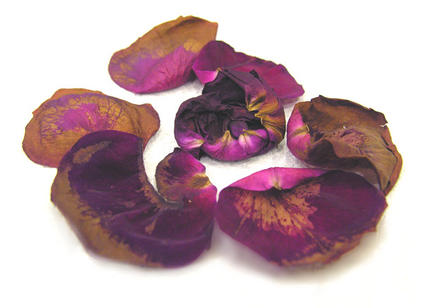
Love the tonal differences of the petals
Post actions
great title, nice lighting
Post actions
Post actions
i find the little bit of blur on the petals in the front to be distracting, but it's a nice shot
Post actions
I like the concept, and the colors are nice, but something is weird about the petals in the foreground. It's like there's no contrast on them or something. Also, 620px on the long side is just too small to compete.
Post actions
Post actions
Post actions
I feel my eye is drawn to the foreground too much.
Post actions
The blurriness of the petals in the front is not working for me, I think it could work if either increased the dof to include the front petals, or to blur the petals in the back.
Post actions
Post actions
Post actions
Nice statement on the ephemeral nature of beauty..
Post actions
Post actions
Creative title and submission.
Post actions
The subject seems to be a little hazy. Perhaps a levels adjustment could remedy this?
Post actions
The vibrant colors of live contrast so powerfully with the dull browns of death. The petals look great against the white.
Post actions
The white background is kind of drowning out the colors of the petals. Needs a little more punch but its artistic.
Post actions
The centre of the image is lovely and sharp , but I find the depth of field and composition clumsy, sorry.
Post actions
I like the title but the haziness at the bottom kind of deters from the shot.
Post actions
It seems a little soft but very nice job with the composition. I like the way the layout leads your eyes around.
Post actions
LOL, if you're referring to what you might be referring to, cracks me up. If you have no idea what I'm talking about, forget I said anything :-)
Post actions
nice tones across the petals
Post actions
The overall feeling I get is that of death.
Post actions
interesting image, but in my opinion the white background is a little over exposed....
Post actions
don't really like your gaussian blur that well...sorry
Post actions
I think you need a bit more contrast, particularly in your shadows, The colours look a bit washed out.
Post actions
I longer exposure might have brought out more detail in the petals.
Post actions
I'm not completely feeling this one... I wish there was a tighter crop maybe, or you had a bit more DOF for the foreground petals to be sharp.
Post actions
DOF seems a bit off, the forground is fuzzy. I do like the colors and patterns.
Post actions
Mmmmm, I really like this. Wow - really is worth 1000 words! It's so emotive!
Post actions
Great colours.
Post actions
This is one image where I scratch my head and wonder why??? This is your BEST image of all your images????
Post actions
The wilting petals she arranged just so, as she wiped a tear from her eye. They were her mother's favorite, these flowers. Their hues had always filled her eyes with a shining happiness, and so she had brought them to her daily to replace the ones that began to die, as much to see that brightness in her mother's eyes as because she could not replace her dying body.







 Add photograph to your favorites
 Add photographer to your favorites


 Photographer found comment helpful.


