I have no idea what is wrong with people's brains. But I am a bit grumpy today.
Yes there's a color cast on it.
It is called UNITY or THEME.
I wonder if people who have an issue with this picture vote exclusively 1 on challenges such as 'black and white in color', 'duotone' and 'soft focus'...
I was one of your 8 10's.
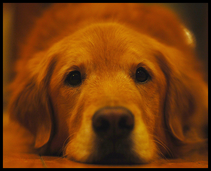
I appreciated the fact that because of the unity of color, distracting elements are greatly reduced and the gentle warm color of the dog is highlighted by the fact that we would probably expect the background to contain many other colors subconsciously, but the absence of these works to build a theme and even contributes to the mood.
Some of the comments here make me want to slap some people upside the head.
The scores however should sit as they do. They represent a 1-week snapshot of peoples reactions to the pic. Don't confuse score with value of the pic. The two are wholly unrelated. DPC is a _public_ contest with a short voting period and this particular one had no theme to give context to the wide variety of styles of image in the challenge.
Jason, came across your thread about this shot. Some thoughts.
You say it does not have a colour cast on your calibrated monitor. OK that's fine and dandy, but based on the comments you have received, to many of the voters it does. Perception is reality, if most people looking at this shot think that it does, then it does and so you have received scores that reflect that. You don't have to agree with people, but accept that this is what others are seeing and understand it maybe why you received lower votes.
I also have a calibrated monitor and to me this looks underexposed (and my monitor tends to be quite bright) and distinctly unnatural in colour. Look at the histogram and you will see it is underexposed.
Add to the equation that not everyone likes pet shots or borders etc etc and you should have a better idea of why the score distribution is the way it is. As Ecce Signum said I would question more why there were so many higher scores than lower ones. I think it finished just a bit higher than I would have expected it to.
At the end of the day, if you really love this and it means a lot to you, does it matter what the rest of us think? Because it really shouldn't. Print it, frame it and hang it on the wall and forget about the rest.
I like dogs, and I like the concept of this shot. I have to agree with the others though, that the color cast is a bit off. My guess is you took the photo under normal incandescent lights. It has that tungsten glow.. And yes - I have a Huey calibrate my monitor.
I took a very quick stab at rebalancing the light on the 2nd example you posted.
I would suggest adjusting the white balance.. it's just too yellow everywhere not just on the dog. I don't mind the grain (in fact I like grain) and all the other complaints - not an issue to me. The main complaint I would have is the color and I would have given this a 5.
It is adjusted, the dog is this color, the floor is this color, the lights in the kitchen are soft white floods, the camera was white balanced before shooting. Let me see if I can find the original to post up.
Here is another shot taken at the same time for comparison.
I would suggest adjusting the white balance.. it's just too yellow everywhere not just on the dog. I don't mind the grain (in fact I like grain) and all the other complaints - not an issue to me. The main complaint I would have is the color and I would have given this a 5.
Nice head-on angle on this adoring and adorable dog. It looks too yellow toned, but it's hard to tell since most of the shot is that color naturally. Good focus on the eyes.
Awwwww! Morgan is Precious! What a great composition! I would like it not quite so blurred, but the cute factor and that soulful look more than make up for it for me!
This makes me smile. What a friendly face and image.
I wish it were exactly centered and the nose were more in focus... but the eyes are sharp and this is adorable.
ha! great doggy shot. i personally like the dof, i think its cool when the nose is out of focus, it gives a sense of depth. color seems a bit orange, but it might just be my monitor
Composition is OK, facial expression is OK, color cast needs improvement. Sorry, not a dog fan here. Still, I remain impressed with DOF. You are getting there with your skills! :)
You know, I don't like dogs. I find them dirty, stinky, annoying and stupid.
But this shot got me to go 'awww, what an adorable friend'. This dog displays none of the things I usually attribute to dogs that make me dislike dogs.
So I'm going to give this a nice meaty score for the subject, and push it up for the skill of the photographer.
Attention to color, texture, lighting, contrast, tone, image depth, composition and final crop are all things that display skill in that department.
OK, let me point out the good things first. The composition is great, although I would of either trimmed a bit more off the left or left a bit more on the right, just to even it up a bit. Those puppy-dog eyes defintely add an extra mark overall :) - The sharpness on the eyes is good, I have two labradors and I know getting the whole head in focus is a pain as they have such long noses!
The negatives are the exposure is a bit low, I can see this was shot without flash and notice a bit of noise in the areas with no detail, but that cant be helped.






 Add photograph to your favorites
 Add photographer to your favorites

 Photographer found comment helpful.


