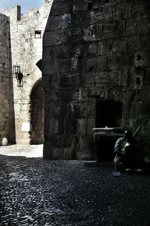
At first I dismissed this as just somebody in the dark, but realizing it's a blind beggar in the shadows gives this a deeper meaning. Excellent composition.
I wish I could see the face better. Interesting choice of composition with the dark and the light. I'm sure some people are telling you the guy should be on the rule of thirds or whatever, but I think the statement you made with the composition ala "hidden in the dark corner" is right on the money. Nice job. I first meant to give you a 6, but now that I have discovered your hidden genius in the composition I'm giving it an 8.
Looks like a cool place. Great light and composition on the left side of the photo. Wish the right side, especially the blind man, had more detail and light.
I feel this image could have been so much better if the beggar was more visible and not so obscured in the shadow. Difficult because you have the well lit section on the left which is what you exposed for. Might have been better to expose for the beggar and then work on the lighter part in editing or a flash could have worked here as well.
The cobble stone is really wonderful, but the greater area of the shot is in dark shadow and I can barely see the beggar. Especially with the highly contrasted background.
This looks like a wonderful shot, but it's so dark, you've lost a lot of detail. My eye is drawn to the very light part in the upper left, and while it's interesting I feel I've missed the most important part of the picture--the begger.
Your subject is the blind man, yet all the light in this image leads the eye to the other side of the picture, the beautiful texture on the stone street, the light beyond the wall and into the doorway. It's almost like you have two pictures in one here - the beggar, and the play of light - but together, at least to me, it is too much. I do love that texture on the street!
Ive looked at this shot a few times now... and am not sure how to comment. I really like the beggar himself, and how the light falls on him. However, with the brightness on the top left, i find that it is competing for attention.
I like the deep DOF to minimize the subject's role in this image. The light on him is effective but I wonder if the bright area on the left is just too eye drawing.
i might have cropped this down to avoid having the bright sunlight in the same photo as the shadowy beggar. my eye is attracted to the sun, and i hardly notice the man. great texture throughout the photo, the cobblestone road and the stone wall add a feeling of rough and hard life
I like the texture created by the stone walls. However, the shadows seem too dark to see the blind beggar. Also, I don't really like the over-light part on the left. Maybe a closer crop to just include the wall directly behind the beggar would allow you to lighten it up a little bit in order to see more of his features.






 Add photograph to your favorites
 Add photographer to your favorites


