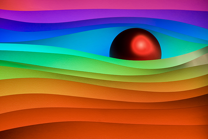
This is one of my paper compositions. I found it incredibly hard to choose an image for this. I wanted something that popped a bit, hopefully not too bright.
Statistics
Place: 148 out of 1129 Avg (all users): 6.2509 Avg (commenters): 7.5402 Avg (participants): 6.2389 Avg (non-participants): 6.3171 Views since voting: 1986 Views during voting: 765 Votes: 534 Comments: 100 Favorites: 12 (view)
I'm surprised at the high number of low scores too. Perhaps part of the reason is that some voters might have regarded this as too much like an abstract painting, rather than an abstract photograph. Well, maybe... ;-Þ I like it, though, but it didn't come up in my 500 votes.
I gave this one a 7, I think I would have gone higher but the bright spot on the ball is a real distraction to me. I think the colors and layering is very nice and the placement of the ball in the frame is great.
If you've seen one cool colored paper shot, you've seen em all... well, except for this one. I think it is the composition you have created with the shapes and the red ball that appeals to me. The colors are great, 10 from me!
Interesting construct of shape, color, and form. Don't take this the wrong way but it almost looks like a 3D-render, I think that has to do with the lighting on the sphere. Overall: muy excellente!!
That red eye amidst the waves of color is really quite jarring. It cuts so readily into the smoothness of the composition that it almost feels like an evil force that's burning its way into the image.
I recognize this as an outtake from another challenge, but don't recall who this is from. Liked it before, like it now. I am gaining much more of an appreciation for abstracts lately.
In some ways this is very, very beautiful. The colours are outstanding, and it is quite commendable that you managed to keep the gradients smooth, no banding that I can see (except on the ball, the banding there is noticeable).
I think what is keeping me from really liking this image is the ball. From a technical POV, the colour on it is too different than the colours of the papers, it is too strong maybe. There is the banding. But most of all, the halo around the edge! In a very graphic image like this one, that halo really doesn't work and distracts quite a bit.
But it certainly is an eye-catching creation! It even looks somewhat like an eye peeping through a courtain.
Nice colors. Interesting lines. Not sure I like the hot spot on the ball - a bit too much contrast between dark outer "shell" and bright red of border of light spot.
Voted earlier coming back now to leave comments. WOW!!!! Such vibrant and bold colors in this abstract that reach out grab you by the collar and scream 'look at me!" BTW, my youngest spotted this on the screen and said "That's cool!" It is indeed very neat and spectacular to look at. The play of curves both on the waves and the red ball show off pleasing shapes and lines that captivate the eye. Now back to the color - they are vibrant colors of the rainbow and this rainbow of color and shapes is very appealing to look upon. I can imagine this hanging on a wall to add some vibrant color to a room or even hanging up in a modern designed and upscale restaurant. Ach...sucker for the color and shapes seen here bumping up to an 8.
They never did discover what happened to him after that incident near Jupiter in 2001. They had assumed he had been destroyed with the ship, and had never really lamented his loss, being a sad and flawed example of Artificial Intelligence in their mind.
Yet he had not been destroyed, not he. In a universe beyond our own, amongst a swirl of colors, he existed still. Slowly, he returned to what consciousness he could claim and parted a sheet of the swirling spectrum and glanced about with apprehension and care. Then, seeing an expanse of a universe new to him and ripe for the picking, the glow of his eye brightened, and one might even say it looked like a grin.
HAL9000 looked about, and saw nothing but a place to rule.
what brilliant colors...love the red "ball"...would be interested in the set up of your shot...hope you include it in your PP notes or better yet...a Tutorial





 Add photograph to your favorites
 Add photographer to your favorites

 Photographer found comment helpful.


