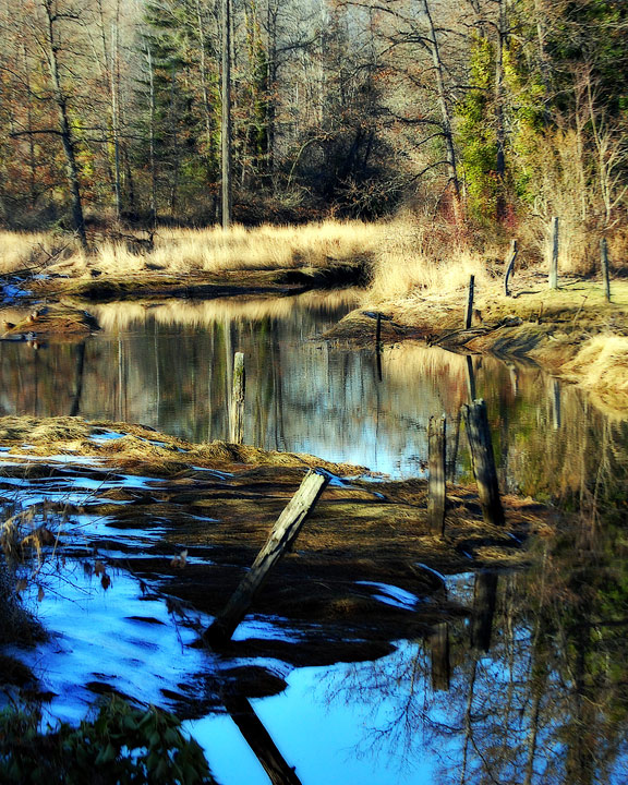
Went up to the Butter Church in Cowichan to shoot for "Architecture", ended up with an entry for "Birds" and this peaceful scene.
After the regular tweaks, and working to make the power pole in the background look more like a dead tree, I added a gothic glow filter.
It's suffered some in the shrinkage for DPC, but I don't know how to avoid that.
You know, I was really torn when editing, because of the colour difference between the two water sections. It really was a major contrast, partly because of the bluer sky and partly because of the shadows, and I couldn't decide whether to work with how it looked or to change it to how most would think it should look.
From the comments, viewers couldn't decide either! :)
Oh, and there's no HDR, just one lone jpeg. I didn't have enough memory with me and had to delete some and switch to jpeg a few minutes before this shot.
I knew I probably shouldn't enter this but I ran out of time to dig and grabbed one. It does look good in a big print, though. The snow just doesn't look like that in the print version... Sigh, I have GOT to get this new monitor tweaked if it kills me!
Statistics
Place: 402 out of 1129 Avg (all users): 5.7980 Avg (commenters): 6.2037 Avg (participants): 5.7633 Avg (non-participants): 5.9868 Views since voting: 921 Views during voting: 657 Votes: 490 Comments: 59 Favorites: 1 (view)
OK, the top half of the photo is great, nice soft colours, crisp reflection. However, then we reach the bottom half and it kind of becomes an oversaturated mess. If I had edited this, I would of cropped off just at the base of the lowest post, then maybe desaturated the blue a wee bit.. readjusting vote from 6 to 5.
Love the composition and the subject but the PP looks a little strange with too much of the vibrant blue in the bottom half of the image. You could have cropped this in half and the top part would still have made a great image! Still, a nice scene and I gave it a 7 but would have voted higher with more subtle PP. :-)
To my eyes, the editing is what I notice first (the HDR or similar), and it doesn't work that well for me personally because it looks too unreal. I like the composition though, it's a strange combination of active/passive, and it works for me.
Very nice locale, tonal range great on this HDR, not too fond of that blinding bright blue on the bottom half. Its looks like it doesn't fit in with the background.
Thank you for sharing this. This is a beautiful piece of work...with one minor exception...tone down those blues, they're a bit oversaturated IMO. Love the processing overall.
Oooh, a wetlands! Looks very much like a place I'd love to explore. Detail in the trees and reflections is lovely. The blue in the water is a bit intense compared to the rest of the scene; I'd either tone it down or consider cropping tighter on the bottom. Still a pretty image overall.






 Add photograph to your favorites
 Add photographer to your favorites

 Photographer found comment helpful.


