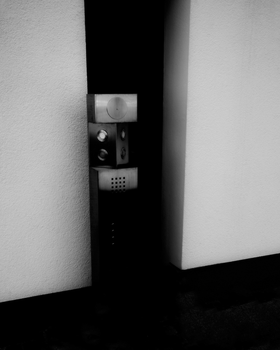
There's a quality of degeneration from the hard lines of a geometry into faded edges of what ought to be planar that I really like here; it seems so simply euclidean in its geometry, but then you notice the apparent curvature of those planes ... Also, the Picabian references are rather neat. I kind of wish I'd had the patience to plough through the whole challenge when I see this (and there a truly grand compliment).
This is remarkable. Your title explains its provenance, but even so it is still a very interesting study of the margins of art and technology. In this photograph, those margins overlap. Shapes and tones and spatial relationships that are aesthetically pleasing, and yet they have a technological purpose independent of all that. I wonder how this fits with the idea that beauty is aptness to purpose? Surely here, the beauty and the purpose are not connected at all? Hopefully zeuszen might comment on this, and help me out. Meantime, its a 9.
Oh dear, don't I feel silly now? Still, you might still comment anyway I suppose.
The gauzy minimalism of this appeals to me very much. I'm sure you're getting crucified by the voters-as-a-whole, but I'm not part of that, as I bump you to 8 based on surreal chutzpah.
This is intersting to look at, but it's more of an abstract thing fo rme because I can't figure out what I'm looking at (I'm assuming it's a card lock from the title, but I have to admit I can't really see the object clearly in the pic).
Back for a bump and comment. I wouldn't have guessed this without the title, but that's fine. I like your processing, it seems to have a bit of glow. I like the composition, but think it could be even stronger if a bit came off the top.
This is the most interesting photo of a card lock I've ever seen. But, it's still a card lock. *smile* It's oddly artistic and appealing... for a card lock. *grin*
I love taking photos of the mundane (such as this card lock). However, this photo is OOF and just doesn't have the correct lighting. I do like the positioning of the card lock and the black and white corners.
This is remarkable. Your title explains its provenance, but even so it is still a very interesting study of the margins of art and technology. In this photograph, those margins overlap. Shapes and tones and spatial relationships that are aesthetically pleasing, and yet they have a technological purpose independent of all that. I wonder how this fits with the idea that beauty is aptness to purpose? Surely here, the beauty and the purpose are not connected at all? Hopefully zeuszen might comment on this, and help me out. Meantime, its a 9.
I find this shot to be very abstract. If that is what you were going for, then its a good photo, but to be honest, it doesnt get much of a reaction out of me.
I am kinda up in the air on this shot. Its simple and minimalistic on one hand. But is it too minimalist? I guess the acid test is: Would I want to print this out and put it up on my wall? Probably not but I wouldn't fault someone if they did. So..the jury is still out. :)






 Add photograph to your favorites
 Add photographer to your favorites

 Photographer found comment helpful.


