Thanks for the comments, everyone! I would be interested to hear from folks who voted low - and more than just, "It's too dark."
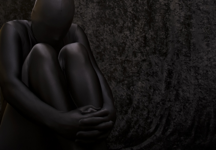
It's not too dark, it exactly the way I, as the artist, intended it. I realize that it will vary quite a bit depending on monitor calibration, but I have seen it on a professionally calibrated monitor at a photo lab, and it looks exactly as I intended it.
I certainly realize that it doesn't appeal to everyone, but that is the point of art, isn't it?
And thanks to the three folks who marked this as a favorite!
with a photo of this nature - you're bound to get an average score. that doesn't mean it's an average photo though. more that you've folks looking at it from the extreme ends of the scale. sometimes the votes aren't given based on the quality of the photo, but on how it appeals to the viewer.
had this been entered in a black on black challenge ( or similarly themed ) it would likely have gotten a much higher score...
well done ! good work with the metering and holding the highlights.
my nit pick - the orangish area on the viewers left ( subject right ) side of the head.
This one took a while to see but what I saw, when I could see it, was well worth seeing. I hope the other voters take their time when viewing this. Nice job.
At first I thought this was a statue but now I think it is a person completely covered in some sort of material. It's a bit dark, maybe too dark for some, but it's certainly interesting.
Interesting concept but I feel the photo doesn't really do it justice. There is so much of the background that is unnecessary. I think it would work if it was negative space but not with that busy background.
This is one of the few "wow" shots I've seen in this challenge. Your theme of contemplation comes through immediately, but as I view this it goes much deeper. The position suggests that the subject is contemplating about something not so good, and that's verified by lack of a real face. The background you've chosen suggests movement and energy to me, especially the "waves" coming off the area near hands. Low key works perfectly here.
I would love to see this on the front page come rollover. New fave.
Nice placement of the subject and I like the difference in textures between the subject and background. However, this is pretty dark and it seems to distract from the picture.
Nice job with the lighting to separate the black on black. Interesting concept to put the figure in an androgynous outfit in this pose. Nice work. The background is distracting me a bit from the message. Ordinarily I'd give this a mid score because of the messy-looking background, but here I sense an attempt to convey a message and fine attention to storytelling, so I will bump to 7 for creative effort.
I have a super bright monitor and this is showing up really really dark... I hope others can see it - very thought provoking shot. I wish there was a tad more space on the left of the frame. Great work!





 Add photograph to your favorites
 Add photographer to your favorites


 Photographer found comment helpful.


