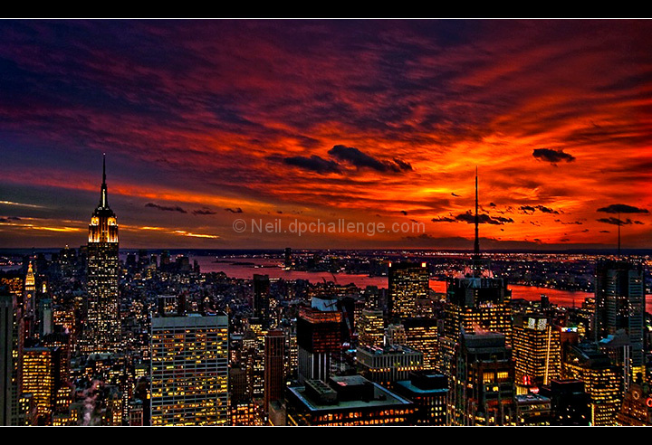
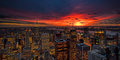
I thought this would do much better, but I guess the perception that it's heavily altered is the most important thing--even if it really wasn't. The sunset WAS this incredible. The major thing I did here, and probably goofed on, was to boost the contrast on the black side), and then perhaps brightened up the buildings too much. In fact, because of the backlight, the buildings needed the most work, but they brightened up very easily (and perhaps I went too far).
I did not use Topaz on this as some seem to think. Or tonemapping, or HDR.
Of course, the original RAW isn't this saturated. I may have touched the saturation in the last edits, but I think what i did mostly were levels and contrast changes. Oh and I ended up cropping it a bit more so the horizon was less centered.
I have these handy from the Archive POTW, so I'll point here. This is actually a different shot, taken a bit later. So the sky is a little different, and more localized, but you can see how intense and beautiful it was even there. It's mainly the buildings that need to be brought out.
RAW:
Processed:
I was planning on entering this wider shot, but when it was reduced, even a little, I started to get worried people would see it as "too small" in details, making it lose a focal point. So I went with the one I did and made the mistake of a boost at the end.
And by the way, it makes an incredible print either on paper or canvas! An earlier edit of this photo was a Kodak Picture of the Day and will be printed in a book about how to shoot winning photos.
Statistics
Place: 164 out of 1129 Avg (all users): 6.2028 Avg (commenters): 7.0750 Avg (participants): 6.1866 Avg (non-participants): 6.2875 Views since voting: 1534 Views during voting: 735 Votes: 498 Comments: 88 Favorites: 5 (view)
Neil, for me this had several strikes against it. First, I felt inundated by sunsets in this challenge, so this suffered in comparison. Second, if my score is hovering between two numbers, and I see a letterbox frame, I'll probably go with the lower number, because I think a letterbox frame adds a quality that isn't inherent to the photo. (I realize that may be unfair, but it's my own personal pet peeve lately). Most important, though, as a result of processing I thought this ended up sort of "muddy." I agree with Ken that the print version looks more realistic and may I add sharper.
Originally posted by oldbimmercoupe:
call me a conspiracy nut, but I also detect an anti-NYC bias here.
Oh yeah, there's that, too. I *know* that's why my entry bombed. ;-)
call me a conspiracy nut, but I also detect an anti-NYC bias here. top of the rock is great place to watch sunsets and really feel the power of midtown far above I(most of) the damn tourists. this is a fine job of raw processing. this would be trite and boring without your heavy hand in processing. it would just be a snap, not art. super job.
I thought this would have scored better also, but to me it looks like the saturation was boosted, especially compared to your print version. The print version looks more natural, IMO.
a little over the top, but then again, what about the city isn't ;-) nice shot. i'll bet you wish they had a frequent riders discount on that elevator...
I like it as much now as I did the first time I saw it, though I still prefer the wider one, personally :-) Hope you're faring well. I contributed an 8 to the total.
Dramatic sky and a nice pattern of city lights with the river in the background catching the red and adding interest. The tone mapping/topaz (?) post-processing gives the image an almost graphic novel feel - I can see this as the cover pages with a superhero in the foreground looking out over the scene :-)
this looks like a scene from this book i read a few years ago called "so you want to be a wizard". i know it sounds corny, but it was an excellent 400 page book for 12-13yr olds. this could be the cover(if it was new york, i dont know if it is or not:/)
SPECTACULAR!!! Some people are going to tell you too much colour, contrast or sat but don't listen to them. You have a great style and this photo is perfect! Best of luck. 10
Extremely colorful sunset. I might have liked to point the camera just a bit more downwards. You would not have to lose too much sky and would bring in more of the city. It feels too cut off at the bottom for me.
I'm hoping to leave comments on as many photo's in this challenge as possible... out of (currently) 1124 images, I gave 31 of them a 9. Your image was one of those 31.
Lots of nighttime/sunset/cityscape type shots in this challenge, but yours is simply spellbinding. I've only ever been to Manhattan twice in my life, and it's one of those places you either love or hate. I love it, but I've never seen it rendered so beautifully. This wouldn't look out of place on any gallery wall. Two things make me jealous.. the fact that you're in New York and I'm not, and the fact that you have the skills to take such a wonderful photograph.
Wish to get a capture akin to this one, one day. Looks like mother nature didn't dissapoint either. The shadows look very pitch black on my screen. Would be excellent if just the slightest detail came out. I'd imagine this would look great on printed glossy. (no vote)
its cool, and the sunset colors are fantastic, but I think the small size probably kills it. I don't know if its oversharpened, or over HDR'd but something just seems overdone here... However, I do like this image quite a bit on its own--it almost could be a spread in a comic book.
What a skyline! I wonder if you went to this vantage point because of the sunset or if you were lucky that day. You caught that at just the right time of day. I bet that a minute before and a minute after it wasn't nearly as good - the balance of the city lights and sunset is perfect!






 Add photograph to your favorites
 Add photographer to your favorites


 Photographer found comment helpful.


