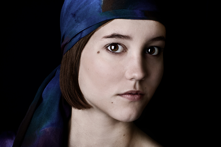
This is a shot from the summer that I have always loved that did not get this biggest reaction when I original put it up online. After going through my archives of work, I found a couple of oldies that I wanted to retouch but none of them really seemed to fit this challenge. Most of my favorite work has already been entered into challenge or doesn't fit within the advanced editing rules. Even so, I love this shot.
Statistics
Place: 389 out of 1129 Avg (all users): 5.8117 Avg (commenters): 6.6667 Avg (participants): 5.8360 Avg (non-participants): 5.6829 Views since voting: 971 Views during voting: 686 Votes: 515 Comments: 70 Favorites: 1 (view)
Contrast is very good here, although highlights not as powerful as they could be, but thats just my opinion. A tighter crop is what I thought of first when looking at this, but the blackness brings out her face.
Excellent job on the lighting. There's a tad bit extra blackspace on both sides and perhaps this would be a bit stronger with a crop, not sure. Only commenting, I gave you 8 at first pass.
Side note: I was going through some boxes of old magazines and found an article about artists throughout time based on a scientific study. Supposedly they used to take an eye and put it dead center, and it appears you've done that here.
fantastic portrait, tons of connection with the subject. It is broad lighting so i'd be interested to see the shot lit from the other side but I think this works ok anyway and the light is nice and soft from the large softbox. I also like the composition and the colours in this shot
Something about the angle of her head seems a little off. I think the image is unbalanced perhaps because her hair and scarf are on one side and nothing is on the other that she is tilted towards. Pretty subject and nice lighting though.
There's a renaissance style of Vermeer/Rembrandt in this. It's as if she's standing next to a window, and partly the catchlights give it away that it's not so. I've a read tip somewhere where dark masking tape is placed on the lightbox to create an illusion of a window being reflected in the eye(s). An excellent shot. Lovely skin tones and the extra whiff of color from the scarf balances it all out. (no vote)
what a pretty name...oh, how it would improve her eyes and your shot if her brows were shaped, as... much as we frame with photography...frame her eyes with her brows...wow would that ever "pop"
This is a fantastic portrait Claire, though the slight softness doesn't work as well at this size as it does on the version on 1x.com. I am viewing it on a 30" monitor though (at 2560 X 1600) which probably doesn't help to do justice to images at 720 pixels.
The blue and black really accentuate her skin nicely. I like the catch lights in her eyes. An old style portrait lighting and composition strait from the masters. Congrats.
Now this I do like. A lot. And I think it's all about the colors. The tone of her hair matches her skin and lips very well and matches her eyes perfectly. The cloth on her head compliments it very nicely and both contrasts with the hair/skin/eyes and lends to the overall coolness of tone.
This is the first headshot that has really jumped out at me and simply demanded a 10.





 Add photograph to your favorites
 Add photographer to your favorites


 Photographer found comment helpful.


