Don't take this the wrong way but as I see DPC as a learning experience here is my frank critique:
This comes across as a snapshot. By that I mean that I feel that anybody standing where you were with a camera could have gone click and got this result. I think a photographer should aim to do more than that. I may be wrong and perhaps you do have more of a story to your shot but the fact is that it doesn't come across to the viewer.
As an example, if you were in Paris and saw the Eiffel Tower you could hold the camera and go click. You'd have a shot that millions of other tourists have and would be good as a record of your holiday. I think at DPC you need more than that. You need to consider the POV - make it something that enhances the tower (include a flowerbed or kissing couple in the foreground), make use of lighting (dusk for shadows), composition (maybe include the buildings beside it to get a sense of scale).
I hope this helps and please don't be offended, I'm only offering an opinion.
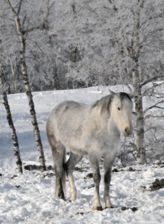
Back to comment: I have to admit that this image confuses me a little. The horse has a painting like softness to the focus, yet the snow on the ground just behind it is in focus. I'm not sure if you did some sort of localized post processing on the horse or what. Some suggestions for improvement: You might want to straighten the image a little. It looks like the horse is leaning to the left. Also, you might want to try a square crop to remove some of the negative space on the left. Normally, compositions are stronger when the negative space is in front of the animal to give the perception that it is moving/looking towards something. Since you don't have space in front of the horse available, a square crop will help balance the composition if the negative spaces are about equal on each end of the horse.
Very different. Looks almost like a chalk painting. I like it in the artistic sense but not necessarily photographically. I feel that it definitely makes a better picture the way it is presented here rather than as a straight photo.
I can't tell if it is a filter, post-processing, or slightly soft in focus. I like the white horse on snow, and the trees in the background give it nice context.
I'm not personally a fan of the post processing here, but that's a personal bias. I like the idea of camoflage, the white horse against the wintery backdrop.
Your processing looks a bit strange to me. This is either because your original photo was out of focus or because certain levels have been pushed too far in PP (Or you're using a plugin that does this to the photo). Having said that, it gives the photo a really interesting quality to it; like a watercolour painting. Unique.
I'm guessing this was cropped in pretty heavily. I like the subject, and the color and light are really well done. The image quality is pretty grainy and a little soft. I think the shot is worth working with to make the best of.. maybe go intentionally very soft and grainy for an "arty" feel?
strange softness in the horse while the snow looks crunchy. The two don't seem to go together - I wish the entire image were either one, soft, or the other, sharp. 5






 Add photograph to your favorites
 Add photographer to your favorites


 Photographer found comment helpful.


