Nothing about this really pops for me, I don't find it particularly interesting or imaginative. I think a different POV would add some nice uniqueness to it.
see this is the thing, there is space and it might be deep but its not taken so ... then it doesnt looks deep... its actually flat.
its grey ( I suggest to play with contrast) and well. that might do it.. but not this.. just three from me , sorry ;D
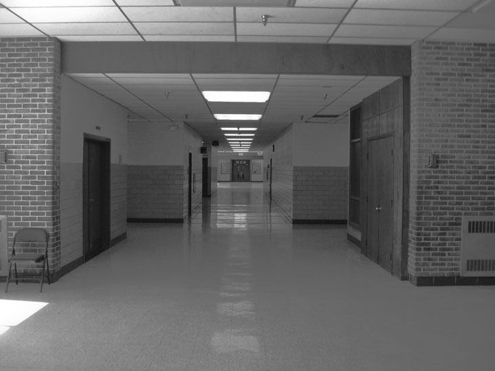
I think this photo would have worked better had you cropped out the wall with the chair and the wall with the radiator...focusing completely on the length dow the corridor. Also more contrast brightness.
Don't take this the wrong way but as I see DPC as a learning experience here is my frank critique:
This comes across as a snapshot. By that I mean that I feel that anybody standing where you were with a camera could have gone click and got this result. I think a photographer should aim to do more than that. I may be wrong and perhaps you do have more of a story to your shot but the fact is that it doesn't come across to the viewer.
As an example, if you were in Paris and saw the Eiffel Tower you could hold the camera and go click. You'd have a shot that millions of other tourists have and would be good as a record of your holiday. I think at DPC you need more than that. You need to consider the POV - make it something that enhances the tower (include a flowerbed or kissing couple in the foreground), make use of lighting (dusk for shadows), composition (maybe include the buildings beside it to get a sense of scale).
I hope this helps and please don't be offended, I'm only offering an opinion.
There's really nothing here to interest me... I'm sorry. Also, it could use some more contrast, I think. The composition is good, but boring. I'm really sorry.
it's a good example of lines converging at a vanishing point, and that chair over there to the left makes me wonder about who might sit there, and how that person might hassle or benefit anyone walking by. maybe a slight CCW rotation would straighten everything out?
i wonder why schools almost always look alike. I would almost wager this one smells like my HS. :P Good use of leading lines, but it feels a bit tilted to the right, and is a bit muted/flat -- maybe needs a boost in contrast.
Interesting idea. IMO, a crop with just the hallway would be more effective - the radiator on the right, sun spot and chair on left, and sprinkler on ceiling are distracting.
Might have tried straightening the horizon a bit better and maybe a balanced crop (same space on both sides). I like the lines which lead us down the middle.
Sorry but this is boring to me. No real story and the tones are bland. One person in the hall would have made a bit of difference and some editing was needed to boost the tones.






 Add photograph to your favorites
 Add photographer to your favorites


 Photographer found comment helpful.


