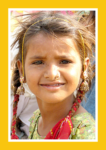
Came back to comment after the gripe thread... for me the border completely detracted from the image as it is really "in your face". I also felt that the lighting was harsh, and the girls eyes lacked focus and sparkle and the shot as a whole lacks some clarity (which I guess is a byproduct of the nature of the camera). Colours framing and subject matter were fine. I scored it a 5, which appears to be the most common viewpoint with 185 others also voting it a 5. Your tags have it as "snapshot" and "candid", and I think that is a fair self-assessment. A nice enough shot but it just didn't wow me. I would probably have given it a 6 if it didn't have the yellow border.
I saw your gripe and as a person who scored this shot kind of low, i'm coming back to explain why i voted as such.
Many of your comments below state something in common, that it definitely has a National Geographic Border, but that doesn't speak to the shot itself. The border to me looks like it was added to give it the title and to cover for the cropping of the busy background (including people). It actually had the reverse effect on me as making it distracting. As for the photo itself. I light on the left side of her face (our right) is way too harsh. It's sunlight and looks to be taken during midday so it's understandable how the light would be that harsh, but its pretty distracting. It makes the right side of her face (our left) look too dark. Her eyes could have benefitted from some lightening up a bit (a curves layer could have helped with this). People already mentioned how grainy the photo is. Lastly i would have had some kind of pulled back some to give people a sense of location. Most NG portraits give you some sense of the location or type of living conditions. So pulling back some would have given that, although I know that you couldn't with all the people in the background.
Some people griped about the dirt on her face....i actually thought that was a plus for the photo. If she were perfectly clean and make up done up....it would be the type of NG photo that you were looking for. The dirt on her face give it the sense of actualy appearance.
I agree with HotPasta.
Also the dirt around her right eye is detracting from the image.
The crop is very good and the stare and catchlights in the eyes are also excellent.
If it was sharper, had less grain, and had a little more contrast it could have scored much better.
I saw your gripe in the forum and thought I would come back and comment...while you have given this the NG look with the border and certainly the girl has the looks for a NG cover, it lacks the contrast, clarity and lighting reminiscent of a NG image. It looks a little grainy and the contrast is a little on the low side...good effort though
WOW, great capture. Thoes eyes really speak to you. Yes, I can see this on the front page of Nation Geographic magazine. Even though border is over powering, I can understand why you wnt for it.
Really has that NG look. In fact looks like a younger version of that famous NG cover shot of that Afghan woman. I am sure that is what you had in mind. Same incredible intense eyes. 8
An interesting portrait. Sunlight is a bit harsh and there seems to be a lot of grain/fuzziness to the photo. I think your border is a bit overdone although I know why you used it.
I like the candid feel for the picture, but I am not sure that I really like the border. I understand what you are going for, but the border isn't my favorite for this picture.
She looks like a great photographic subject, but I think you missed the mark a little bit. Nothing in her face seems to be in sharp focus. Also, I realize you tried to emulate the National Geographic look with the border, but it just doesn't work me. The whole thing is also pretty small compared to the 720px max.
Voted earlier coming back to leave comments. What a lovely portrait of this young girl! Nice smile on her. What adds further interest is that she lives in another country and we see that from the adornments in her hair and jewelry she wears. I as the viewer wonder which region she is in and the story of her culture - is there a cultural reason why she wears the nose ring?, is there a festival going on that she is wearing fancy earring and dressed so colorfully? - there are some interesting stories to be told about this girl's culture I am sure. The focus is good and the capture is a completely natural candid - in other words it does not feel posed such that we feel that we are there and have spotted her in a crowd. I know that you added the thick yellow border with the white trim to look EXACTLY like a National Geographic cover but I think it puts too much emphasis on that it could be on the cover rather than let the picture of this young girl and her culture speak to us directly with no border or a very little one. I see that the sun was most propably bright when this was captured and I think the colors must have been much richer in contrast and tone in real life than the camera captured. I think a boost in brightness and contrast levels as well as a small adjustment in saturation levels would really make her stand out. As it is here the skin tones and color tones overall seem a bit washed out and the vibrancy of the yellow border cover just calls all the more attention to that.
This had potential yet the focus needed to make the cover of NG is lackin a bit with this photo & the the lighting is also a bit to harsh ~ the subject matter works well though.
I normally don't like big frames, but your concept makes me smile. She's a terrific subject. A well done "candid", though I wish the light were a little less harsh.
The border really makes you think of NG but personally hate that color of yellow! Nice natural shot. Makes me wish it wasn't such a close-up & could see more of her surroundings to get "the rest of the story".
Yes, it does look like it, with the colors on the border and all. Parts of the face are a little blown out. The nose ring (I think) looks almost like something more disgusting. Good shot appearing to show both poverty and opulence.





 Add photograph to your favorites
 Add photographer to your favorites

 Photographer found comment helpful.


