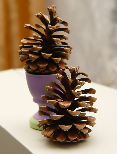
This is horizontally centered but not dead center. To my eye, dead center is about where the green dot on the egg cup is---not the main visual element of this photo. The focus is excellent. That dark corner of tablecloth is pretty distracting. Nice blurred background. The subject is kind of dull.
VERY sharp details of the pinecones. The stand/vase looks a bit out of place as its colors are pastel vs the earthy tones of the 'cones. Same with the orange section in the background.
Excellent smoothness and clarity to this macro work. Tooo much of a shoe-in to the theme for me however - sure, as a pair they're arguably centred, though equally validly, as individuals, they're nicely (almost) on the classic thirds lines. Composition could have been simplified to good effect i think - bin the coloured egg-cup, white-out the wood and there'd be a suitably scandinavian feel to this. 4
I just don't see any focal point in particular. Colors are nice and soft, but maybe just a little sharper focus and less cropping would make it a really pleasing arrangement.
There are distractions in the background which detract from the overall feel of the image. A nice backdrop would help a lot. Also looks like the rear cone is out of focus.







 Add photograph to your favorites
 Add photographer to your favorites


 Photographer found comment helpful.


