Changed my mind a couple of times. Decided to go with something different from everybody else (hopefully!). You will need to stand out from over 700 entries in this challenge.
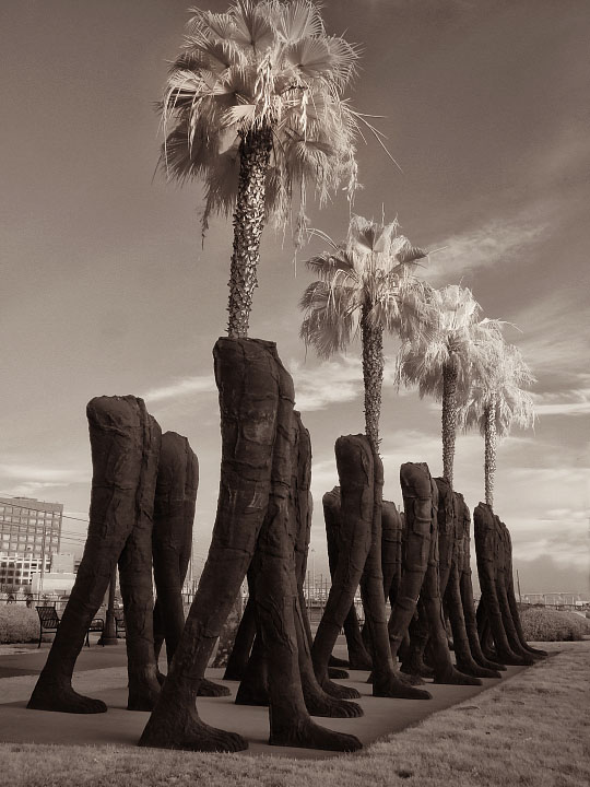
The photo is of a scuplture group called "Walking Figures" by artist Magdalena Abakanowicz. The trees are next to/ behind it so I tried to allign them to appear as though they were coming out of the headless bodies.
Shot in infrared. Cloned out lamp post on right side. Converted to BW and toned in Nik Silver Efx Pro.
Some fine tuning of tint with hue/ sat. Resize, sharpen.
Statistics
Place: 633 out of 1129 Avg (all users): 5.4675 Avg (commenters): 6.1228 Avg (participants): 5.4591 Avg (non-participants): 5.5132 Views since voting: 938 Views during voting: 649 Votes: 492 Comments: 64 Favorites: 0
really cool image ... I'm wondering what those are made of ... sand? plaster? wood? it's hard to tell from the picture ... I think that the sepia tones were a good choice here ...
On my first glance, I actually thought that the trees were part of the art. I'd say that is an indicator of something effective.
I wonder if the fact that the trees all seem 'linked' to the legs that are in the front was part of the decision process for choosing this pic.
The IR treatment is 'so-so'. I'd prefer a stronger contrast in the sky, especially in the top third to make the fronds stand out better. This could have been done in post processing.
I would definitely call this a 'mediocre pic with a little something special'. Seems to fit nicely with the challenge. 6.
Voted earlier coming back to leave comments. How very odd and surreal! Seeing this out on the street would definately get me to stop and take a closer look. This is like a cross between Dr. Suess and Salvador Dali. I really like how you composed the shot to have the trees look like they are the torsos of the statue legs. Tones are good but I am not sure the sepia choice really spotlights your composition. Oh man, now she is going to critique and get picky:-) Sepia tones typically are used to invoke the feel of old times/times past or the emotion of nostaligia. Your main subjects are surreal and either color would do them justice or a treatment of black and white to highlight the shapes of the objects and the textures. I would love to see this in B&W where the tones are dynamic and really pop off the page. It would really play up the surrealness of this composition.
What a bizarre sculpture! I like the angle you chose to shoot from. It makes it look like pour of those guys have tree-heads. I like the toning as well. I can't tell if this is an IR shot or just a cool B/W conversion. I'm leaning toward IR though.






 Add photograph to your favorites
 Add photographer to your favorites


 Photographer found comment helpful.


