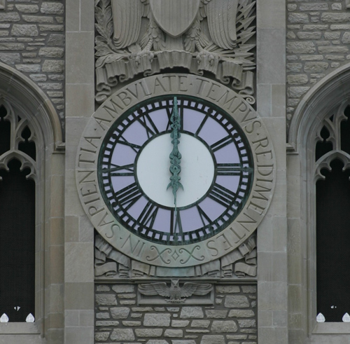
The beautiful clock is nicely centered, but the bold horizontal columns keep my focus from staying on the clock with this amount of cropping. I would be interested in seeing a little more contrast or brightening applied and see how it looks; it might benefit from a little sharper detail.
A little dark on my monitor, but a good composition and technically well done otherwise. I just wish there was something in this photo to give some punch, like if the lavender of the clock face was lit up or if the lighting in general were more dramatic. As it is, the image leaves me feeling a little flat.







 Add photograph to your favorites
 Add photographer to your favorites


 Photographer found comment helpful.


