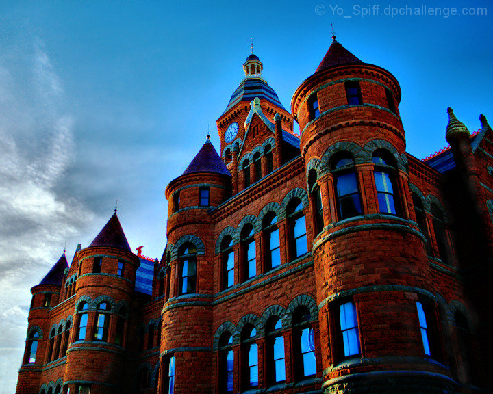
The Old Red Courthouse in downtown Dallas, constructed in 1890. Restoration was started in 2001, completing in 2007. It now houses the Museum of Dallas County history & culture
I've done a few false HDR's before, but this is my first real HDR of multiple exposures that I am actually pleased with. Photomatix basic (Free version) with some clarify and other adjustments done in PaintShop Pro.
Pre-challenge notes:
I'm pretty darn pleased with this, (Could have used some more of those swoopy clouds, however) but I have learned my own appraisal of my shots is often wrong. A mid to upper 5 would be nice to get out of this.
Post-challenge notes:
I hit my expected score for this, but I was kind of hoping it to be more of a killer shot than that. Comments suggest I may have cranked up the cartoony HDR look too much, but it does not look oversaturated on the two calibrated monitors I have at work and home. Still did fairly well, and I'm pleased.
Statistics
Place: 82 out of 184 Avg (all users): 5.5952 Avg (commenters): 6.0000 Avg (participants): 5.3919 Avg (non-participants): 5.7553 Views since voting: 1998 Views during voting: 302 Votes: 168 Comments: 16 Favorites: 0
I'm a fan of wild colors from editing. This shot will make me go back and look at mine again and see how they might look with some Topaz. It never occurred to me to use that before your suggestion. Thanks!
Let's start around a 5.5 image. That's a good place because it is an image with promise that let us down. I see you were hoping for more on this one too. The choice of subject is good. A very interesting building. Your composition is at least not straight on, but it is a bit static in that there is little or no context for us (sometimes that can't be helped and I don't know what's there that I can't see). The HDR is a good choice because it allowed you to keep detail in the sky, BUT I see two problems. One, and I'm pretty sure you know this now, your colors are crazy. I'm all about saturated colors, but not when they look unnatural. We've hit that point here. Two, the clouds in the sky are too lopsided. You have half a blue sky and half with clouds. I think that generally degrades the image and sometimes you just have to sit and wait until you get a better balance.
Actually, I like it and its cartoonish appearance. It gives it tension - the old imposing castle meets scooby doo so to speak. Its funny - DPC voters tolerate cartoonish landscapes and interiors but not often buildings. Or maybe I'm just odd and find beauty in the contrasts. I like this better than most that placed higher...
Great angle for this building, and a gorgeous building. Maybe a tad oversaturated but that's a matter of personal taste - if you like it, it's good. The one hazard to HDR I haven't figured a way to fix yet is the tendency for it to add a lot of reds. Since you started with a red building, it did crank those up a bit. The range is good, though - brings out the textures and detail very well.
Very cool building, I love the old buildings they have so much character. I wish colors on this one did not look so unrealistic, I think they hold the image back. The reds and blues appear to be over saturated, the clock in the tower even has a blue cast and I assume the clock face likely should have been white.






 Add photograph to your favorites
 Add photographer to your favorites

 Photographer found comment helpful.


