Author Thread
Post actions
I almost forgot about this. FWIW, I was one of your 9's. WHee!
Post actions
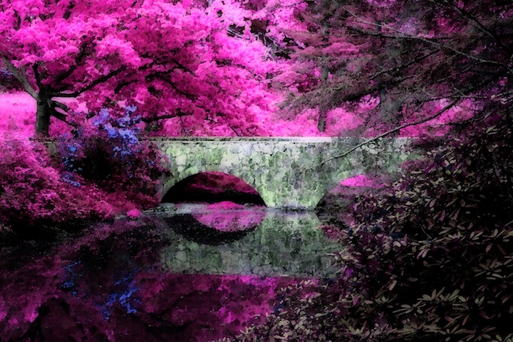
I'm just going through the bottom end of the shots and I'm really surprised to find this scoring so badly. I can see from the comments it's because of the manipulation, but still, it's really interesting shot, and whether you like the colours or not the actual photograph (in terms of composition, light etc) is very good.
Comments Made During the Challenge
Post actions
A little over the top on the processing, but it works well. I assume originally an IR?
Post actions
Yipers! This is not appealing to me. *sorry* (If I don't tell you... you'll never know about voters, huh?) The strong pink really just overwhelms me. It's artsy... but ... I just can't like it.
Post actions
Amazing choice of colors. Very Old Master.
Post actions
Post actions
That's very impressionistic I'm sure. I guess one has to really like that style to appreciate it. I can see it's well done but I am not a fan of impressionism myself.
Post actions
Surreal, actually. Very nice.
Post actions
As an impresssionist photo, this works, but otherwise, I think the processing has taken the photographic nature out of this shot.
Post actions
Not sure how I feel about the pink, but I do like what the filter has done to this. Nice. - bumping
Post actions
where ever was this...so very pretty...somewhere in the Carolina's? Very nice and DIFFERENT!!!
Post actions
Good idea. A bit to much on the coloring for me.
Post actions
MMmmmmm - I like this. The surreal monetesque look does it for me. Very well done. :)
Post actions
sorry I have to give you just one... it didnt do for me...
Post actions
Post actions
not my taste but i am sure others will
Post actions
does not appeal to me , sorry, just a comment no vote
Post actions
Sorry, colors totally blown out
Post actions
Post actions
This is just a bit overworked for me...
Post actions
Very nice image. It's good to see a few "great" images. This is a perfect reflection of your abilities as a photographer.
Post actions
Although I like the colors in this and the impressionist feel, I would prefer something a little less processed.
Post actions
very abstract and interesting - keep it up
Post actions
This looks like a painting. The pink is a bit overdone for me, but it's interesting looking.
Post actions
Interesting use of colors
Post actions
Nice composition but a bit over processed for my taste
Post actions
Fun shot. Interesting color choice.
Post actions
Striking pink, but tends to overpower the central subject and draw the eye up and left out of the shot. Perhaps there is enough texture in the bridge that it could take a stronger colour and reserve a secondary & more muted or complementary colour for the trees - thereby making the bridge stand out?
Post actions
You have to like the color to care for the impression. The limb distracts. Reflections are nice.
Post actions
Processing has created a beautiful image here. Well done.
Post actions
I love this reimagining. It's like Miles Davis playing the Flintstones Theme. 10
Post actions
Perfect titling. The first thing that came to mind was very impressionistic.
Post actions
Amazing colors, it definitely looks like a painting.
Post actions
I can't believe this but.... I almost like this! ;) The whacky colors are just a bit too much though. Very interesting photo.
Post actions
Back to comment: The composition looks good but I don't find the coloration very appealing.
Post actions
Post actions
the pink is just a bit over the top IMO
Post actions
This shot is neat and I think I understand what you're going for here, but all in all its just not working for me. Sorry.
Post actions
The unnatural colors are giving this photo a special effect. I like the bridge.
Post actions
yikes a little too pushed maybe?
Post actions
Very cool coloring, nice impressionism.
Post actions
I was initially jarred by the colors, but as i study it I realize how lovely the spring setting is. nice work.
Post actions
Remarkable interpretation of a simple landscape.
Post actions
Beautiful colors but the post processing really flattens this image, not in a good way...
Post actions
That's some crazy hot pink. If it were a little more subtle, I think the photo would be more balanced as a whole.
Post actions
Post actions
I like it. It makes you re-examine what you see for context.
Post actions
Post actions
Im not liking this kind of coloring or editing but I do like the subject.
Post actions
wow, great color and post processing treatment, this belongs on a wall
Post actions
Post actions
An explosion of pink! I like the impressionistic qualities
Post actions
don't really like the colorization in this shot, but it has great composition.
Post actions
I once did a pic that had strong color effects and was told that 'DPC folks don't usually go for heavy processing like that'.
Post actions
that just hurts. totally overfiltered.
Post actions
Really pretty, but the pinks seem to be clipping (blown out).
Post actions
Hmmm Really not sure it's doing anything for me, just being honest. I would like to see the original, and then a true B&W conversion.







 Add photograph to your favorites
 Add photographer to your favorites


