"I wonder if he got as much negative unhelpful snarky comments as he gave me."
comment form one of my previous challenges..
gee Stu.. .okay it was negative but I couldnt explain it... you know what? I will mark the things I dont like in red and post it on other portal and send you link, maybe you will understand...
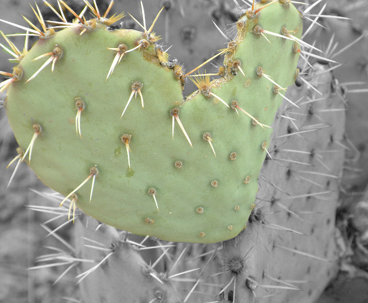
top lef spike ... you can clearly see there that wrong postprocessing there is green colour to be seen over it . I dont know how where you doing this selective colour but its wrong. and you can clearly see the boundaries of the green heart too.. its nice idea but not very well performed. there is another unidentified line on the left side and the bw conversion is flat. I didnt want to insult you or to be rude, Im just trying to explain you that the initial purpose wasnt achieved ...
nice effort at doing the selective desat to highlight the shape. Unfortunately the overall image has an unattractive washed out look.
try bumping up the green slightly, For the B&W portion , play with the contrast and make it look even more out of focus to artificially exaggerate shallow DOF.
Very helpful i tried that and it made a ton of difference Thank you for your time
oh no no sorry for three but the bw conversion is totally flat and the selective colours didnt help it rather unlucky combination btw, is badly cropped too , coz you cant see the whole thing from the left and top
just the idea is nice
okay Ive changed it to one... the post processing is terrible sorry...
oh no no sorry for three but the bw conversion is totally flat and the selective colours didnt help it rather unlucky combination btw, is badly cropped too , coz you cant see the whole thing from the left and top
just the idea is nice
okay Ive changed it to one... the post processing is terrible sorry...
nice effort at doing the selective desat to highlight the shape. Unfortunately the overall image has an unattractive washed out look.
try bumping up the green slightly, For the B&W portion , play with the contrast and make it look even more out of focus to artificially exaggerate shallow DOF.
The photo itself appears to be well taken and a nice close up of the ol' prickly pear, but I'm not a fan of selective desat on the best of days. I realize you did it to emphasize the heart shape, but it just doesn't do it for me. The selection is pretty sloppy as well.





 Add photograph to your favorites
 Add photographer to your favorites


 Photographer found comment helpful.


