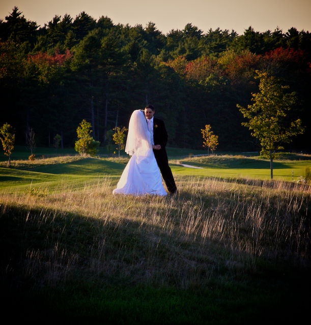
Very peaceful scene at the end of a chaotic day I'm sure. You can see the love between them. I might have cropped some of the bottom to keep them from being in the middle of a square and to remove unneeded picture parts.
(Voting completed - back to comment on random images)
As a pro wedding photographer myself I feel you have made several mistakes with this shot. Firstly it would of benefited from seeing the brides face. Secondly, I cant really make out the expression of the grooms face so I am very detached from the image as a whole. Thirdly I would of preferred this shot with a long focal length, wide aperture lens, it would of compressed the shot a lot more and given it a nice sense of depth. Next up is the whole area of darkness at the bottom of the shot.
As a whole it is a rather poor wedding shot and not something I would expect to present to a paying bride & groom. Revising my vote from 5 to a 4. I hope the criticism is of benefit to you.
hm wedding photography ... well first its taken from pretty large distance and that dress is purple and then the place itself isnt such nice I have to give just four sorry , please dont take it personally Im amateur anyway ;D
Nice, but I'd like to see a little better exposure on the groom. Perhaps a little turn and a slightly different shooting angle would remedy his shadow.
good lighting here, I recommend a more landcape crop here. Loose the lower shadow portion. Also recommend to remove the blue cast on the wedding gown and just lighten the shadows on the groom slightly
This is very nice. There's just something about the color of the sky that seems a bit dreary for such a happy moment. Maybe a tighter crop would have worked better (IMHO)... just to get rid of the brownish hue of the sky.
It seems to me that the bride and groom are the main part of this subject, yet they are relatively small in the frame. As a result, detail is lost -- it is difficult to even see what the groom looks like. It does a nice job of giving the context of the shot (a golf course, perhaps?) Also, having the b&g centered, and the tree on the right makes this composition feel very "off" to me. It needs something "high" on the left side of the frame, OR a vertical crop instead of the squarish one here. I fully understand this may be the effect you want, but it just doesn't translate well to me.
This is ok for a wedding snapshot but not liking it to much more then that. The sun was to bright. Maybe if they were in the shade it would be better but its just not to interesting to me.






 Add photograph to your favorites
 Add photographer to your favorites


 Photographer found comment helpful.


