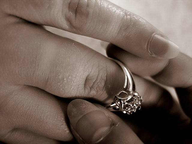
Really not sure if people are going to understand this photograph or not, as the whitened ring mark doesn't show up well against pale skin to give a more clear explanation of what's going on. The habit is of course removing the ring from the left ring finger to "fake" a single status. I had many other ideas as well for this challenge, but liked this the best of the lot, despite the ugly, unpolished fingernails. Sorry about that.
Editing: Resizing, curves, brightness/contrast, Neat Image, and some colour toning from the original black and white it was shot in.
Statistics
Place: 51 out of 256 Avg (all users): 5.4363 Avg (commenters): 6.8571 Avg (participants): 5.3119 Avg (non-participants): 5.5267 Views since voting: 1130 Votes: 259 Comments: 17 Favorites: 0
Why you mark as "helpful" only praising comments? ;)
That one from 16point2mm about motion was the most helpful here, I guess. On other hand, what is a help from just saying "Good picture though"?
Thanks for pointing that out. I missed that comment entirely. The other one isn't marked helpful because it's not. :) The person missed the point of the photo (the indentation.. not swelling) and didn't give any useful feedback otherwise. I mark nice ones (and criticisms) helpful because I appreciate people commenting. I can only think of two other comments that have been made in my DPC career that I've not marked helpful, but I could be wrong. Only those two stand out though, and I think it's obvious why they're not marked helpful.
Why you mark as "helpful" only praising comments? ;)
That one from 16point2mm about motion was the most helpful here, I guess. On other hand, what is a help from just saying "Good picture though"?
I think the concept is fabulous, and there's real skill in macro work here. My only disenchantment with the piece is that I have to look at the title to understand whic direction, if any, the ring is travelling, and the title is also my only clue as to how this fits in with "habits". While dreadfully difficult to do in macor shots, a shutter speed long enough to create a blur on the ring and "right" hand to denote direction of motion would have been a stronger clue.
This image seems a little dark and lifeless. Maybe if it weren't in B&W it would show some skin tones and color in the ring. Good focus and depth of field.
Great closeup. The DOF is good and the details are well captured. The composition is rather nice, I like the diagonal lines created by the fingers. The sepia choice makes this a more compelling shot - almost like one of those dreamy ring exchange shots from a wedding.






 Add photograph to your favorites
 Add photographer to your favorites


 Photographer found comment helpful.


