I have to admit I have in the past kind of groaned when I would seen yet another drop shot in a challenge, even though some of them were very nicely done. I decided to give it a shot myself and I have to admit that it is kind of addicting. Getting the focus right (I do not own a "real" macro lens) was my biggest challenge.
I decided to take a chance, against all the 1's that I will likely receive just because it is a drop shot...because I feel it has artistic merit because it is different then most of the drop shots you see here at DPC. Not necessarily better, just different.
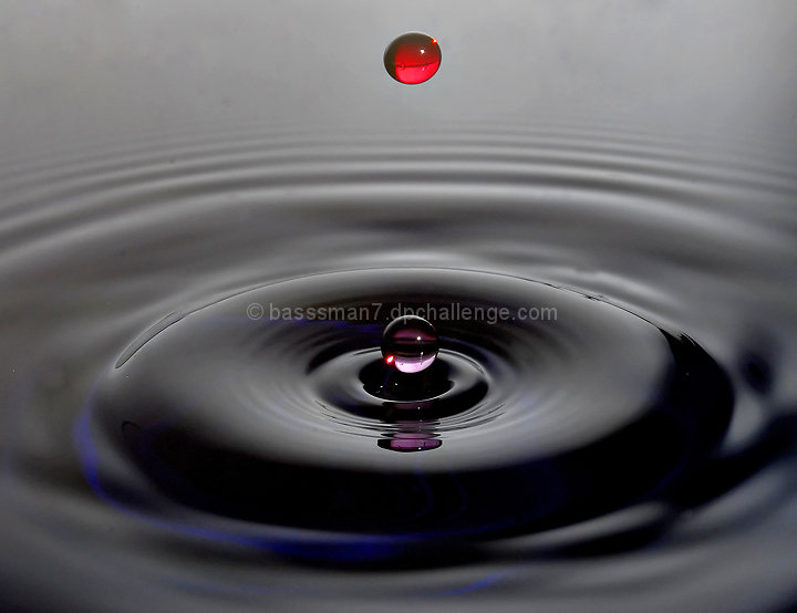
I really like the Symmetry in this image.
It is a drop of red food coloured water being dropped into some dark blue tinted water. As a result the drop closest to the water almost appears purple since it gets light bounced back off the blue water mixing with it's red colour.
Statistics
Place: 143 out of 436 Avg (all users): 5.8301 Avg (commenters): 7.6667 Avg (participants): 5.7570 Avg (non-participants): 6.0000 Views since voting: 2134 Views during voting: 285 Votes: 153 Comments: 16 Favorites: 1 (view)
man...you did get whacked by the anti-drop brigade. I mean its not the best drop picture ever but its still pretty darn good. Then again, I never get tired of water drop pictures.
It is easy to brush past this as just another dpc water droplet photograph but your post processing makes this shot rather cool. I like how you have different colours in the droplets and even the reflection of the bottom droplet.
I like this image. At first glance, the middle drop caught my eye. I like the colors chosen for the drops. What I wonder is if you did a tighter crop on the purple drop, what you would get. It's sitting so perfectly above the ripple. Also, (my .o2 which doesn't mean jack) the background seems to show through a bit much for me. Hence the thought of a tighter crop. Your focus is spot on. I like how you were able to capture the base of the ripples along with the top drop also bring in focus. Overall, nice work! 7






 Add photograph to your favorites
 Add photographer to your favorites


 Photographer found comment helpful.


