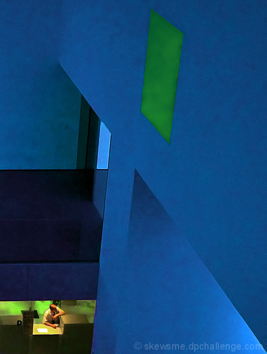
Everything Paul said but what he didn't say (or see, maybe) was the giant "I" formed by the structure dwarfing the guy - of course standing for "Information". 'Grats on the thumb!
Sometimes the simplest juxtapositions are the hardest to see. This huge abstract superstructure towering above the tiny human at the desk makes a startling example. It's impossible to just note the presence of the man and say "Oh!', and accept this image at face value ... it's too laden with figurative possibilities. If I were a writer (which I am) it's the sort of image that could inspire me to write a novel, just so this could be on the cover. I might call it Have a Nice Day. Or perhaps Your Call is Important to Us. Of course, there's nothing much wrong with Information.
I award it a 10. And the deeply dubious distinction of The Order of the Thumb.
Coming back to comment, voted earlier. I can't put my finger on what it is I love about this image so much, but I do love it. The colours are wonderful. I love the peeking down looking at the man behind the desk. The processing you have chosen gives it a painterly feel. There are elements of this image that make me feel like I am looking at an Edward Hopper painting actually. And that is always a good thing in my opinion. Actually, just bumped it too.





 Add photograph to your favorites
 Add photographer to your favorites

 Photographer found comment helpful.