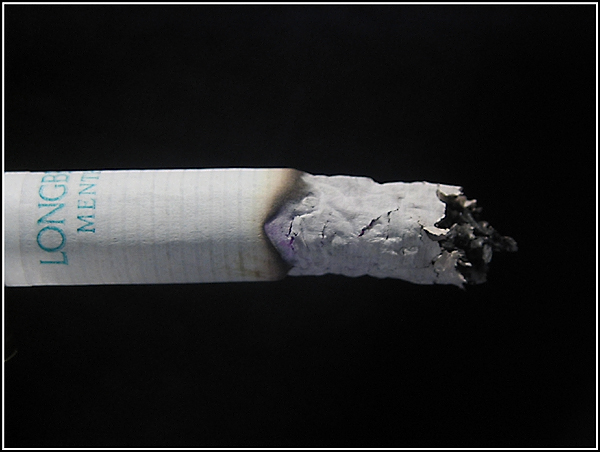
I thought this looked more like a "Habit" shot than a "Macro" shot... ;-) But it fits both. A nice touch would have been rising smoke and/or a little glow. Don't know if you had practical reasons for not doing that. The composition is a bit centered, but OK. The results are generally good - sharp, nice lighting, good job of keeping the background black.
There are a lot of photos of cigarettes around. I think all of the better ones have some of the burning area visible and perhaps even some smoke. Aside from those issues I think it might have been better to take the photo before the cigarette was burned so much. That way you could have cropped off the section with the writing. I don't think that portion is really necessary as we all know what a cigarette looks like and the writing pulls the eye away from the ash.






 Add photograph to your favorites
 Add photographer to your favorites


 Photographer found comment helpful.


