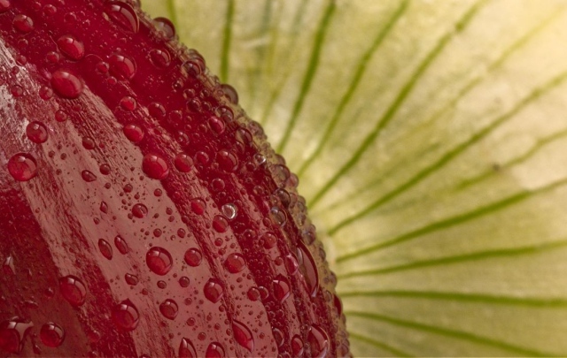
Compositionally, the two elements of your shot are nicely balanced. I also like the curves on the red and how it contrasts with the lines on the green.
Technically, it is a wonderful study in contrasts. As mentioned above, the curves counter the straight lines, as well as the greens contrasting with the red. The focus on the water drops is good (which is always a dpc favorite ) and the dof is enough that the green onion doesn't compete too much with the red one. The colors, though, seem a bit flat. Maybe a touch more contrast or playing with levels or curves would help.
Overall, I think it is an interesting shot, a good take on the challenge and well done.




 Add photograph to your favorites
 Add photographer to your favorites


 Photographer found comment helpful.


