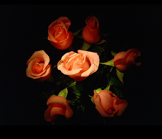
Love the lighting here. The additon of water drops softens the overall image a bit and adds some excellent contrast. Very nice, soft romatic feel to this one. 8
Very cool shot. I like it. I might have adjusted the lighting on the rose to the left of the center rose to match the other surrounding roses. Good job.
Having gone to the trouble of making that asymettrical border, it might have been an idea to use levels just to take the black in the image all the way to absolute black. Good detail and light, especially the fading away toward edges. One of the better flower portraits here. 6
Seems like some artificts of editing are present with the horizontal bars. Great lighting on the central rose, could use a bit more lighting on the rightmost area.
how cliche the roses and the waterdrops on them! I don't think this is a nice picture to look at, the composition doesn't do the flowers well, and the black background doesn't fit the colour of the roses.. Technically, I think it's a pity that some roses in the circle are more lit than others..the rose in the middle is beautifully lit though! maybe without the others, only the rose in the middle would have been more nice to look at..then the kitsch (is that English?) would have worked for the photo..
Though I like the contrast and drama between background and subjects, I find the lighting to be too uneven so that the out rim roses are not evenly lit. Compositionally, I would have preferred a different shooting angle. Perhaps directly over the center flower and with all the roses bunched closer to gether






 Add photograph to your favorites
 Add photographer to your favorites


 Photographer found comment helpful.


