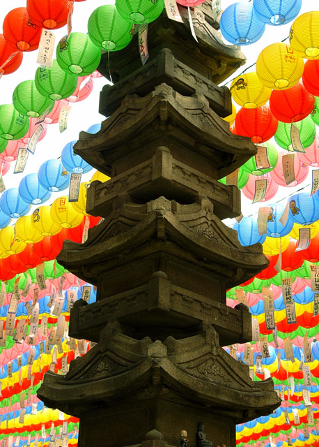
really tough shot to expose. the pagoda looks muted and the lanterns are almost overexposed. a little fill flash could have help depending on the flash and your distance to the carving. good concept and great colours. good luck. P
Definatley different. like al the color. I wonder how this would look with the lanterns out of focus. If you could make just the pagoda in focus and the lanterns out of focus, wonder how it would look. maybe something to try anyway. focus is good, and I think that the lighting is good as well. I like the shadows on the pagoda. only spot that is a bit of a distraction is the white sky showing through the lanterns in the upper left. ~Heather~
What a great shot! The tower seems a tiny bit crooked and it would show more detail if it were lightened a bit (just the tower, not the lanterns), but this is a great photo with excellent colors. Nice job!
I love those lanterns, and they work very well in this shot. Great composition and colours. Effective stock photo. Could do with perhaps slightly richer saturation.
You got a bit too much going on with all the bright lanterns and the very dark pagoda. Maybe if you lighten the pagoda a bit it would draw us more inward. I may have cropped the top a bit to remove the lanterns that over lap your main objects. Just my thoughts.
Very colorful and crisp. I feel that for me it is too tightly cropped in order to "make" it a centered composition. It doesn't draw me in. It could use a little straightening. IHere, the column goes thorugh our whole picture; I would like to have seen the original to see where it is in relation to its surroundings.





 Add photograph to your favorites
 Add photographer to your favorites


 Photographer found comment helpful.


