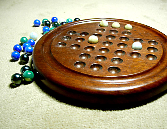
A nice idea for the photo.. To me, there are a few issues that distract from it though.
1) The background. I'm not sure if the carpet works as a background, especially in the front where the texture is very pronounced.
2) Sharpness. The photo overall seems to lack focus.
3) Contrast. There are a lot of blown highlights in the picture. Especially in the top.. It has lost all detail. If you don't know what a 'histogram' is, I would recommend reading up on it.
4) Lighting. The light source looks to be fairly harsh (Like a bright lamp close to the subject?). This is why the bright areas are too bright, and the shadows are too dark and harsh.
5) Composition. I actually find the composition to be the best thing about this photo. Everything is on nice angles, and you've followed the rule of thirds to add some visual interest.






 Add photograph to your favorites
 Add photographer to your favorites


 Photographer found comment helpful.


