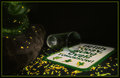
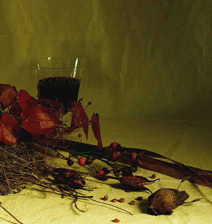
Surprised how much I still like this in spite of my not managing to get a lot of things right. Found the poor wee corpse the day before and scanned the garden for the accompaniment; next day cleared table that gets light from 2 windows, set up, wait for good light, and fiddle. A good bit of time spent, then the light went.
Statistics
Place: 146 out of 182 Avg (all users): 4.9793 Avg (commenters): 5.2941 Avg (participants): 4.7619 Avg (non-participants): 5.1463 Views since voting: 1034 Views during voting: 240 Votes: 145 Comments: 18 Favorites: 1 (view)
The lighting strikes me as falling off too much toward the rear of the image. With most of the color tones being so close to each other, I think it really needs some brightening up. The square crop does not work for me either, there seems to be too much empty space at the top of the frame for my own preference.
Is that a dead bird? A little morbid for a calendar, I'd think... Not really sure I see "November" here, and the choice of lighting is interesting. I think that fold in the fabric in the background is rather distracting.
Nice image aside from the wrinkled background with some fold lines too. I find them distracting features to the background. I'm not sure how the dead bird fits in, but that doesn't bother me nearly as much as the fold lines.
Not crazy about the backdrop - it is too light and better lit than the leaves and wine... and I really don't get the dead bird. It doesn't get to fly south? But it is clearly an attempt to do something creative and different, so extra points.
a dead bird...really (please tell me if it is not a dead bird)..the shot is a little dark (in a couple of ways) correct the lighting (and dead bird) and it would have really wked
I like the tones in this...woah! I just noticed the dead bird...um, this is an odd mix of wrinkled backdrop...foliage, death and wine in a glass which seems to me a bit too pristine for the overall rustic feel of the pic. 6





 Add photograph to your favorites
 Add photographer to your favorites

 Photographer found comment helpful.


