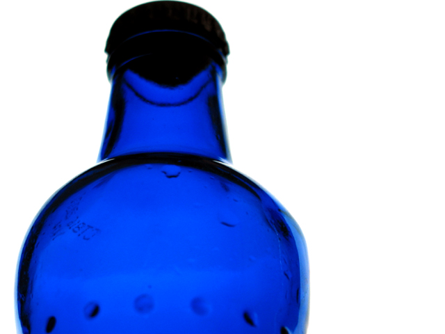
better composition could have made this one a winner! - needed portrait(tall) image, filling area as much as possible and tilting the bottle top further away. - Colour and exposure superb!
Pull back a bit to get the bottle off the top edge of the picture! I love the white, white background, you pulled it off without blowing everything out!
Cool. Maybe good to see a little more room on top, and not quite so much space to the right. I'd have turned the bottle to avoid the code at L. Very nice clarity and color.
The bright lighting makes the neck of the bottle appears to almost separate it from the body. However, the droplets inside the bottle detract from the symmetry, and the cap feels too dark - perhaps a shot without the cap on would have helped.
Now that i'm down to my final 20 images, the scores will be getting much better :) I love the color and contrast in this photo. The bottle curves are excellent. This is an interesting perspective on a bottle... I would have expected to see it in a portrait orientation rather than landscape but the off-center perspective of this adds to the quality of the photo. The only thing I don't like about the image is that the top of the bottle is too close to the top of the frame to suit me. I like a little breathing space but that's just my opinion... Kudos! = 9





 Add photograph to your favorites
 Add photographer to your favorites


