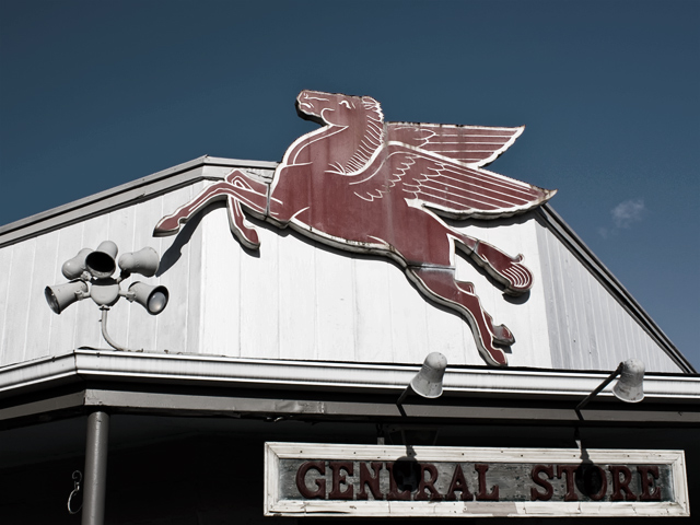
like this shot...to bad the shadows of the lights are on the General Store sign...seems like level/curves would help with the wash out of the building, might have helped with the red in the photo too...
I wish the red were more saturated in this, that would make it pop more for me... Something is lacking here but I can't put my finger on it. I think that the composition is just a little too dull perhaps?





 Add photograph to your favorites
 Add photographer to your favorites


 Photographer found comment helpful.


