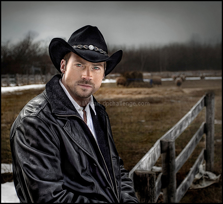
Again I have to thank Max(Quigley) for letting me submit this pic. I had a session with Dave(model) and his partner Cindy this day to get some shots for his portfolio and some of the 2 of them.
Max came along and was a great help and pleasure to work with! Max was lugging some stuff and holding the reflector and managed to get some excellent shots as well (one of which he was going to enter)
I had another shot I was going to submit but after processing this one, I really liked how it turned out and asked Max if I could submit this. Being the great guy he is Max said "go ahead and submit I won't put one in"
Thank you so much Max!
Thx to Dave and Cindy for the great day we had!
First entry with my new bling... canon 17-40 f4L I like the 3Dish effect going on here.
Thx for comments and votes.
Post: This is f&^#%#^ awesome! I am surprised and so glad to see this ribbon. It was a fun shoot! Dave is a great model and he is trying to break into the "Biz" and the shoot we did was for his port. You can see more of him here
Dave's pics
Thx again! Tough crowd! Great images in this challenge with low scores!
Edit to add: some asked about the lighting: Simple it was overcast this day so the sky was a big huge softbox(Sun on the left. you can see by his shoulder and face)and my trusty ass't Quigley with reflector on the right to light his face. That's it.
Statistics
Place: 3 out of 436 Avg (all users): 6.9677 Avg (commenters): 8.4211 Avg (participants): 6.8667 Avg (non-participants): 7.1800 Views since voting: 7125 Views during voting: 314 Votes: 155 Comments: 53 Favorites: 11 (view)
It's easy to see why this did well (lighting, DOF, and that DPC sharpness) but for me this would work a lot better had you shown a little restrain and refinement in your editing like what you've demonstrated in the past with your other work. In terms of detail, the guy and his clothing look great (at this size anyway), but everywhere else the detail just looks like digital fuzz, a nebulous of noise/dead pixels masquerading as detail. That might work as a style but when you coupled that with the fence, which appears to be growing a colony of pixel fungus along its edges, it becomes too much. You've really pushed those pixels well past their breaking point. Frankly, I don't know why you just didn't keep the background untouched. You probably would have scored well over a 7 had you did.
Leo, I'm thrilled that you took a ribbon with this shot. If you remember back to our discussion over your entry as to weather or not you should change the boat
(which is also a fantastic photo) for this photograph of Dave, I said to you that, "I not the best photographer but I know a great photo when I see it
and this one of Dave is a ribbon winner!" Turns out I was right, now if I could only do that for myself :) I would finally have a ribbon of my very own. One can
dream can't he :)
I had a fantastic time on the shoot and will always be there to help if you need me, thank you, your a great photographer and I've had the opportunity to learn so
much from you in the short time we've been friends. You're generous with your knowledge of photography and patient with your teaching, your truly a GREAT friend.
Like what you did with the processing. Makes this a unique portrit. Lighting is great on him. It provides great textures in his jacket and hat. Plus his eyes are crisp. 9
If I get that exact jacket and stand in that exact lighting, will I look that good? Not a chance, but I like to think so, nonetheless. Just as well, because if I did, I would have to hire people to follow me everywhere with those lights, and it would get expensive....
Great lighting. His face really pops. I'd like to know more about your lighting setup. I'm guessing you have a softbox or umbrella on both sides at about 45 degrees. Slight criticism: The background almost looks fake because the light on him is so sharp and considerably lighter. I think the strobes would be a little more natural if you brought up the ambient slightly. Then again, this has a very unique and punchy style exactly as is. My favorite so far. 10
Great portrait. The only thing that bugs me is that he stands out too much from the background...almost like he's in front of a poster. Perhaps a higher exposure on the backdrop of this would have given it that extra edge IMO. Still, wonderful shot, wonderful editing to the model.
I like the bw shot of him that you did in a similar pose better. The lighting on his face looks a bit forced in post processing in this one. Very nice clarity and dof though.
I saw your other shots on the forum. I think the eyes are a little hyper-realistic but other than that, great shot! Oh, and the boken is a little weird looking to me, maybe over sharpened?






 Stetson Man
 Add photograph to your favorites
 Add photographer to your favorites


 Photographer found comment helpful.


