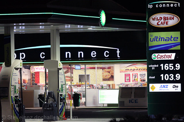
I gave this a nine in voting, it is a great natural diptych. It seems like it could have been an ad. I really like liked it, sorry other voters didn't agree.
Good clarity, nothing is too blown out. I'm not sure what is the central focus here though. Also, I must admit that it bugs my brain a little to have the "o" in "connect" cut out so completely.





 Add photograph to your favorites
 Add photographer to your favorites


 Photographer found comment helpful.


