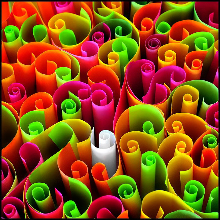
POST: The Image took ages to prepare and because they were flouro coloured, the saturation was quite high, but what you see here is pretty close to the real colours. I didn't up the saturation. I am happy with the shot and am impressed it landed 12th. I really thought it would be further down the list. So, thanks everyone.
Statistics
Place: 11 out of 92 Avg (all users): 6.4035 Avg (commenters): 7.6471 Avg (participants): 6.1509 Avg (non-participants): 6.4800 Views since voting: 7019 Views during voting: 565 Votes: 228 Comments: 24 Favorites: 2 (view)
this looks like a ribbon .. i've seen two others so far .. but i dont think like the voters usually .. but the colours and shapes in this image are amazing .. love the gorgeous shadows and lighting .. absolutely fantastic .. i notice there isnt any blue .. maybe you can get that when it rolls over .. lol . :)
I love the curly-cue shapes, and the white curl really helps focus the eye in an otherwise very busy shot. A bit oversaturated, especially the pink highlights.
I like this very much, but the focus seems very soft--since there's so much movement, it would be more comfortable to look at if the focus was sharper.




 Add photograph to your favorites
 Add photographer to your favorites


 Photographer found comment helpful.


