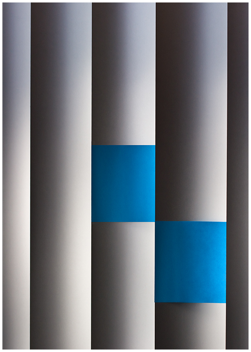
Basically straight from camera, a little skew adjustment to square the geometry, a little wedge cloning on the left postit to square it up as well.
Hand-held, thus the 400 ISO
*******
Is minimalism alive and well on DPC? We shall see. I bought a ton of postits and was working on various elaborate constrauctions+backlighting, and to be honest it bored me. I decided to go with some clean and simple instead. Probably gonna get hammered I know, but I like it, a LOT.
Statistics
Place: 42 out of 92 Avg (all users): 5.7546 Avg (commenters): 6.8000 Avg (participants): 5.6275 Avg (non-participants): 5.7939 Views since voting: 1435 Views during voting: 411 Votes: 216 Comments: 18 Favorites: 3 (view)
PostLuminous Award WINNER!
Well, I could go on and on (and usually do :-), but suffice it to say that this is simple, elegant, beautiful in tone, texture, color, shading, shape, form, composition.
The fact that it was done with post-it notes matters only for the challenge qualification--but this image stands apart from any challenge limitation, and no reference to post-its is needed to appreciate it, no explanation is necessary or value-added in that context, as it could diminish the pleasure of contemplation.
5.75 is pretty darn good for an abstract on DPC, IMO. I was expecting to find this down in the 4's, simply because that's where abstracts normally fall. You pulled it off well. I gave it an 8, BTW.
This strikes me as an LPatrick entry. Cool looking abstract. Nice shading of the gray tones. That's tough to do with JPEG. I have a lot of problems with banding on such things.






 Add photograph to your favorites
 Add photographer to your favorites

 Photographer found comment helpful.