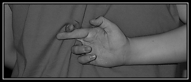
The composition and concept are very nice here, I like the folds in teh shirt and how they lead the eye back to the subject of the crossed fingers. The photo seems to be oversharpened or just slightly harsh and could use a little bump in the contrast to brighten up the whites.
Very original, I didn't saw this idea until now. But I think that this photo could be better, maybe the composition or the resolution, I don't now what is exacly but it can be better.
There are an awful lot of jaggies in the shadow areas and weird white speckle things on her hand. There is a marked lack of contrast in the tones. Interesting crop. Original idea and it is certainly a habit.
clever idea. the bunched up shirt creates a distracting vertical line. And the photo quality looks like it was either very low res, or very highly JPG compressed.
Ah, one of the few ORIGINAL ideas in this challenge. Looks good in the "slim Jim" framing. Techinique wise, it has some problems: 1) The print is "muddy" with o real crisp whites and no "black blacks." 2) This is exacerbated by the bright white in your frame - that white competes with the image ... and it wins.
Original interpretation
It would have helped to have the model relax his/her muscles.
The hand seems held too close to the subject’s back and the hand is tense, pulling the finger too tightly behind the other.






 Add photograph to your favorites
 Add photographer to your favorites


 Photographer found comment helpful.


