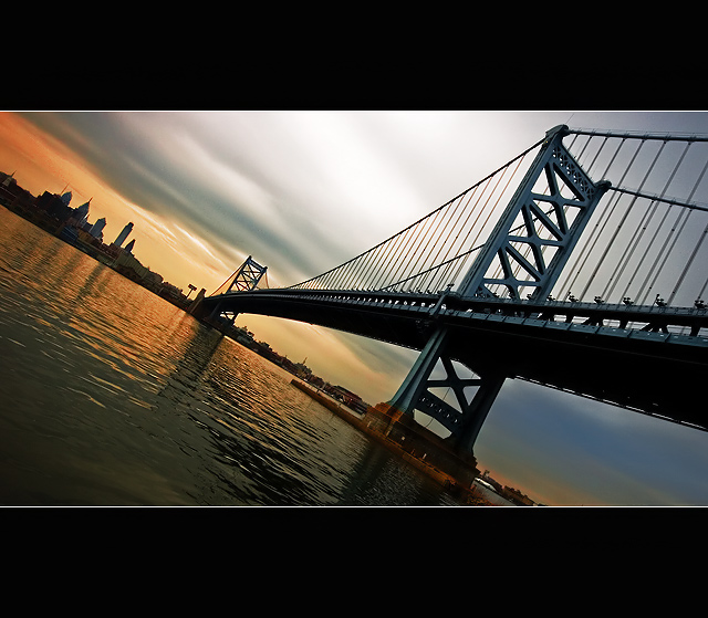
This is the Ben Franklin Bridge and Philadelphia in the background, taken from across the Delaware River, in Camden, NJ.
I was going to take a break on shooting this bridge, but was driving to Philadelphia from NYC and the weather was just spectacular, had to give it a go. I don't generally like shooting the same subject, unless I can improve on it, and with low flying clouds before sunset you can't beat that.
Post-Processing:
Imported RAW file into CS3
Conversion:
Increased 'Recovery' to 100%
Increased Contrast + Exposure
Brightened 'Darks', Darkened 'Shadows'
Tweaked Colors to make oranges more red, cyans more blue
CS3:
Crop to 8"
Cloned out sensor crud visible in sky
Select Black Point on bridge
Selective Color/Replace Color/Hue&Sat to bring out the reds & blues a bit
Curves/Levels for Contrast
Selective Color > Neutrals > Increase Blacks, to take out the gray pixels
Resize 640px
USM 500%/2/0
Neat Image
USM ~200%/2/0
Add Border
Save for Web
*****
PB and a Ribbon!!! oh man, thanks for the votes and comments!
Statistics
Place: 1 out of 176 Avg (all users): 7.2426 Avg (commenters): 8.3810 Avg (participants): 6.8833 Avg (non-participants): 7.3944 Views since voting: 6605 Views during voting: 390 Votes: 202 Comments: 58 Favorites: 21 (view)
wow adam .. how did i miss this ... ?!!!
CONGRATULATIONS ON THE BLUE, A PB AND THE MOST EXCELLENT AND BEAUTIFUL IMAGE ..
lol .. looks like the voters reckon you 'improved' on this .. !!..:)
I think what makes this image so great is not just the absolutely perfect colors, but the great "balance" of all the parts. The bridge and the water is perfectly balanced in the pic which makes the "tilted" concept work great because you don't feel like anything is out of whack. Awesome!
I just don't get the whole border deal.....it just takes so much away from the picture as far as being up close and personal with the subject. I can't say whether the picture is good or not because of the lack of detail.
The "Image" part of the submission would not be any larger, and you would not be able to see any more detail if the border wasn't there, as it is cropped @640px as per basic editing rules. Without the frame, the image just looks too wide for me, which is why I put it in there to stabilize the shot and have some black to contrast against, instead of the grey of the DPC viewing pages. Of course its just a personal thing, I just happen to like how it looks.
You really made up for your brown ribbon entry with this one! This has exactly the kind of "glow" I had been referring to that is distinctive of your shots.
ETA: I have to agree about the letterbox border, though. Not caring for this trend, but that's a personal preference thing.
I just don't get the whole border deal.....it just takes so much away from the picture as far as being up close and personal with the subject. I can't say whether the picture is good or not because of the lack of detail.
I really like this image. Meets the challenge well and it is interesting. I would have scored it higher if the black bars of padding weren't a part of your presentation. 9





 City Askew
 Add photograph to your favorites
 Add photographer to your favorites

 Photographer found comment helpful.


