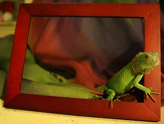
This is my green iguana Obi Guana Kenobi (named by my dad)
Very hard to make her/him (we still cant tell) stay still !
Last second entry, didnt saw the challenge until 3 hours or so and im studying, so lets see how it goes ! =)
Statistics
Place: 49 out of 278 Avg (all users): 6.1192 Avg (commenters): 7.2500 Avg (participants): 5.9245 Avg (non-participants): 6.2532 Views since voting: 1457 Views during voting: 454 Votes: 260 Comments: 13 Favorites: 0
Great name for this iguana!!!:-) A slightly above average shot but it needs a little work to move it into the above average category. First there is too many elements within the shot that 'overwhelm' your main subject. You want the iguana to be the focus of the attention so don't overwhelm the shot with too many textures, shapes and above number of objects within the shot. Your main subject occupies maybe 20% of the picture - bring us closer to your pet show more of him/her off by having the reptile fill more of the frame (especially the full body of the animal for missing the tail is a lost opportunity to show more of the coloration of this reptile). Not only that bringing us closer to your main subject will showcase the texture on this pet. I do like how you choose the red and green cloth to compliment the green and red stripes of the animal. You could keep it more simple and clean in presentation by just laying the iguana on that nicely textured green cloth such that it would be a primarily green on green composition. Or you could go the complimentry colors route with having the green reptile on the red cloth (the pairing of the red & green colors would be very appealing to the eye) If you went in that direction you would have to make sure that your lighting was absolutely spot on illuminating the iguana perfectly and eliminating any shadows - for that you would have to have lights on either side. If you use flash to fill in the frontal lighting you would have to make sure that your subject is a far enough distance from the back cloth so that it does not throw shadows on the back cloth.
Cool idea. The white balance seems off. the top left corner is very distracting as well as the immediate foreground. Using similar fabrics to what you use in the rest of the photo could have helped. It would be cool to see what you could do with this concept in an advanced editing contest.
I like this. Re-edit this for your later use but everything out side the frame, including the frame convert to B&W. Leave the reptile green. It will look really cool.





 Add photograph to your favorites
 Add photographer to your favorites


 Photographer found comment helpful.


