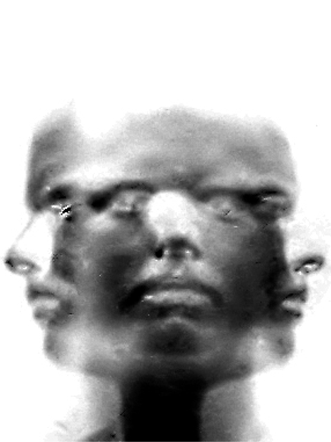
This shot was taken of me, with a black backdrop. 15 sec exposure time, in complete darkness. I had a bright led light that I used with a piece of tissue over the top to soften it. I spent approximately 4 seconds in each position with the light on. The light was turned off when I was rotating my head. It was then inverted in PS, and levels, brightness/contrast, were adjusted. It was then cropped vertically...
Statistics
Place: 50 out of 148 Avg (all users): 5.5830 Avg (commenters): 6.8889 Avg (participants): 5.1957 Avg (non-participants): 5.7696 Views since voting: 1367 Votes: 283 Comments: 16 Favorites: 5 (view)
rule of thirds not used? i beg to differ! top of head 2/3, mouths 1/3, three faces separated into thirds. this is a very good example of the rule of thirds in a photograph!
Composition: It is obvious there is one person's face repeated 3 times. The focal point is the eyes although the noses seem to draw attention to them because of the higher contrast created by the little white dots. The rule of thirds is not used in this image and it looks fine the way it is. There is added space at the top that is left there to accomodate the longer thinner composition. The space at the top is more important than say cropping out part of the noses. The black and white of this image add to the starkness/expressionlessness of the person's face. I'm not sure what the harsher areas near the left eye and a bit under the right eye of the center face. This image works well with each face with the same expression. Did you try using 3 different expressions? I think 3 different expressions would have improved the impact slightly because it would have given extra meaning to the photograph. Each person has more than 1 emotion and the image would have helped portray that.
Technical. The image is quite soft... and it is evident that the softness was intentional. I would have liked to see a little more detail in the face. I like the fact that the hair is not visible. Each of the side faces blends fairly well with the blank background. I do find the grey area around the right nose distracting because it's not part of the image. It's just grey. Also the left nose is much more transparent than the right nose.. why? I personally would have boosted the contrast a little bit more..
Overall I think this is a very neat photo and I agree that it should have done better. Well thought out and reasonably well executed. Good job!
Bizarre! What are the marks from? (ex. left side eye and nose, middle right eye) I am sorry, but to me, this seems more photoshop than photography. I am very willing to re-examine my score. 7 Swash
This is good except for the little bits of photo-debris on the shot at eye level. Take those out and it would be a 9 - with it, a little less - Inspzil
I think this is cool. I like how it ended up. Might be a little too digital for some voters, but it's all legal so... I should try this some time. Just afraid I'd get dizzy ;o) ~indi





 Add photograph to your favorites
 Add photographer to your favorites


