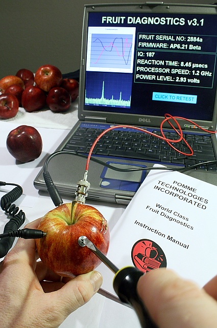
The idea was brillant, yet I gave you a 6. As already said, lighting could be enhanced, too many distracting shadows here. the OOF finger at bottom right is also an issue. Lastly, the image is very busy and the close crop enhances this impression. I fi had to redo this image, I'd leave away the apples in background, the left cable, the illustration on the "manual and put the notebook in a straight, centered position. A black backgound and soft side lighting should do the rest.
coming from the thread, IMHO
- Lighting is big issue here. Everything has light, nothing bring focus to your subject. Also its harsh and there are more shadows.
- Too much going on, I would think you don't need the other apples in background, just one subject
This was a great idea, and executed well. I think the downfall is the lighting, which although not bad, lacks impact. Maybe more capable lighting-types could explain why better than I can.







 Add photograph to your favorites
 Add photographer to your favorites

 Photographer found comment helpful.


