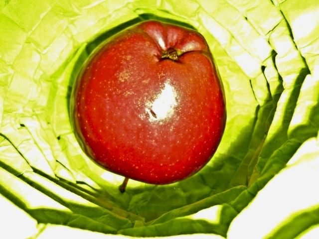
I understand (or at least think I do) what you're going for here. I applaud that because of the artistic experimentation. For that alone voting a 6. As a suggestion, maybe a bit softer light with the high contrast would have helped a bit here. Just a thought.
Red and green can be complimentary colors, but it doesn't work here. The light is just too harsh and nothing's really in focus. For shots of food to work the viewer needs to be able to imagine eating the food, and here the apple looks like it's sitting in the bottom of on old hollowed out lettuce. Very unappetizing.
Is it cabbage? Good idea to use complementary colors. But the lighting needs a lot of work IMO. All the details are lost in the cabbage or what ever it is. Also, ligting on Apple is harsh.
Looks very confusing to me. Maybe that's what you were going for but it almost gives me a head ache. I can't tell if it's going in or out and the bright green is rough to look at. It may sound harsh but I don't mean anything by it, just trying to help.






 Add photograph to your favorites
 Add photographer to your favorites


 Photographer found comment helpful.


