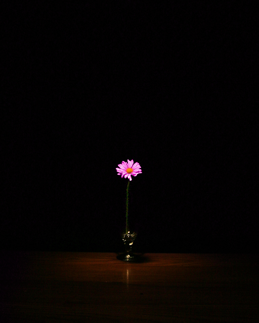
Smashing. This will look great framed. the lighting is perfect, the colour saturation works well too. I might like a little more detail on the vase, but that's minor. I'm sure some will tell you it's not centred, but they're wrong :) I hope this does well.
I almost didn't look closely at this pic. It's really very nice. The flower is centered. the light is directly from above, and just enough to illuminate the table the vase is on. Very effective.
Great. I really like hte negative space. Gives the impression of a sole flower in a gigantic room. I'd like to see the horizon more flat (it's tilthing to the right in my eyes), since symmetry appears to be an important quality of this photo. Good job. Nice splash of color. Jacko. 9
Very simple, very cool. Nice color on the dark background just the right amount of woodgrain showing for effect. The only thing that I would have done would be to crop quite a bit from the top, you flower would still remain the center focus of this shot. Great Job.
Yes, it's a classic, some say overdone, concept . . . but the perfect pop of color and the graceful lines made it an 8 for me. It is a slightest variance from the usual too, in that it is a rich dark brown background vs. a black one.
Very nice setup with excellent lighting and negative space. Only two minor flaws: camera might not have been level as I can see a slight angle and I might have cropped a bit tighter off the bottom. 7







 Add photograph to your favorites
 Add photographer to your favorites


 Photographer found comment helpful.


