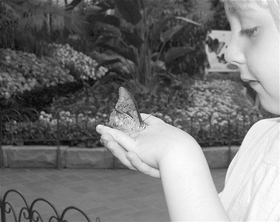
The picture has the big AWW factor, as it is adorably touching, with child
and butterfly. I believe butterfiles should be in color, to better appreciate
their beautiful wings. But on the good side, it is centered so it fits the theme.
And i know it wasn't easy to have a butterfly to stay on a person's hand,
even if perfectly still. In color I would give it a higher score, but as it is, I give you
a 7
I guess this was a spontaneous photo, so dificult to plan... but the background distracts from what would be a great photo. The forearm looks a bit over exposed and, given that it's a butterfly we're looking at, is b/w the best choice?
47K ? the limit is 150. It is compressed too much. Less compression would significantly improve the quality of this one. The JPEG artifacts in the background are visible enough to distract from the subject
Challenge centered – 5
Creative – 10
Appeal (is it interesting?) – 10
In Focus/Clear - 8
score 8
This is a beautiful picture of the child and butterfly. I am drawn to the child's face. I am sure the butterfly is what you wanted everyone to look at.
The child's skin tone is rather washed out (from flash, I suspect). I'm baffled by the choice of black and white for a butterfly garden. The background could have used a bit more blurring. The fence in the lower left corner is distracting. The composition is really nice (with a teeny bit more cropping of the left side of the frame). I gave it a 5.
Good choice of subject and the child's glance leads you right to the main subject, however the contrast is a little low and the backgroung is not blurred enough and therefore distracting. A larger aperture (smaller number) would help blur the background more. 6
The blat of that flash is real pity -- murdering the detail in foreground. I guess it would have been near-impossible without it, but that doesn't stop it causing problems. Would it have been impossible to crop in tighter on the hand and the butterfly? Might have made for a much less snap-shot-like composition.
IMO, this would have done better with color. It looks like the colors are lovely - but there isn't enough contrast as it is. Of course, I realize that perhaps that is why you chose black/white - sometimes too much color doesn't show well either.







 Add photograph to your favorites
 Add photographer to your favorites


 Photographer found comment helpful.


