As I look at this image, I can hear this voice in the distance. It's hard to make out what it's saying........wait, here it comes again.......I got it. It said tooooooppppppaaaaaazzzzz.
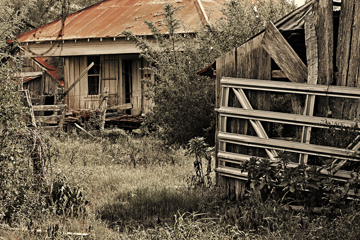
I prefer this one over the other edit because the processing really seems to fit the scene. I bet this was a wonderful place to explore and take photos.
I think I prefer this edit, although the glow is very nice as well. I think the rustic feel of desat+warming goes better with the old feel of the photo. Your editing comments are very helpful, I am looking forward to trying some of them.
I prefer this edit, it feels like the old west. LOL! The only thing missing is granny on the porch on a rocker with her bottle of moonshine and Jed behind the cracked door with his rifle. ROFL, just kidding. Lovely edit!
I definitely prefer this version -- I think it fits the feel of the place much better.
I make all my B&W/duotones "by hand" so I don't know how much control that action gives you, but I think I'd have used a somewhat different "second" color ... not sure though If I'd go warmer or cooler -- I usually experiment a bit to see what works.
I think I like this one best, Deb. It gives it a by-gone days look.
The building itself arouseS nostalgia. It is such a pity that development is getting rid of the old character-filled places everwhere. (Not that I would actually want to live in one of these old places, I just like to see them.)
I like this 'Troy' processing Deb - It gives the old place more of a dilapidated feel and as Lynne lynnesite said it reduces the starkness of the metal gate.
Never used Troy; I'll have to try it after looking at this! I love the tones, the rusty-looking roof and the hint of green in the grasses. I so love abandoned broken-down houses!




 Add photograph to your favorites
 Add photographer to your favorites


 Photographer found comment helpful.


