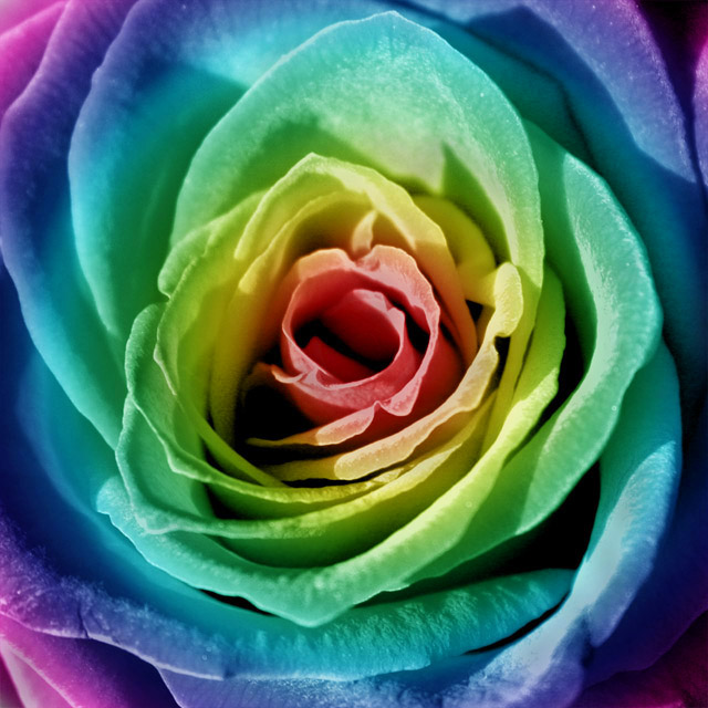
1)Cropped photo into a square
2)Desaturated the image
3)Adjusted Levels and Contrast
4)Used the Gradient Tool for the rainbow
5)Placed the rose on top of the gradient
6)Selected the gradient for the history brush
7)Went over the rose with the history brush set on "Soft Light" at 100%
8)Readjusted Levels and Saturation
9)Unsharp Mask
This one was a lot of fun to mess around with!
Statistics
Place: 104 out of 240 Avg (all users): 5.4260 Avg (commenters): 7.8571 Avg (participants): 5.3793 Avg (non-participants): 5.5283 Views since voting: 1394 Votes: 169 Comments: 11 Favorites: 6 (view)
I plan to steal this idea (not for DPC though!) and probably with a different technique, although I may try to follow your's 'cause I've never tried it like that. Great idea, execution!
Here's one I missed. I really should have voted on all the Centered entries. I keep discovering new ones.
This is really FAB-ulous. It would be incredible blown up really large. Love the square format. Love the guady, glitzy rainbow colors. Why be too-too precious about a flower? Need I mention the great lighting and sharp focus?
Nice to see you take a different approach to a standard rose shot. I think that for DPC this image may be more than the average voter can appreciate. For me, I like the gradient you've used. I do think that if the overall exposure of the rose had been better, you'd have achieved an even better result. You can see in the highlight areas of the petals that you have large 'flat' areas of color. These areas would prolly be overexposed areas that didn't take your color treatment well. The focus may be somewhat soft as well. Not sure if that was your intent, but it keeps the image from having a professional polish.
Overall I think this was a nice change of pace. A few tweaks and you'd have a very interesting print to hang on your wall.
Although creative, the "technicolor effect" applied to the rose just doesn't do it for me. I do, however, appreciate the effort you must have gone through to get the desired effect if in fact you had to do all this yourself. I will give you extra brownie points based on that assumption.
Don't like this I fear. Quite apart from the over-the-top colouring (obfiously, only my opinion), it seems slightly over-exposed (details blowing out in the more saturated areas), and the direct light isn't helping communicate the softness of the flower - which would make a real contrast with the bizarre tones. 4
This is one of my top 4. I am curious to see how the rest of DPC repsonds to the colorization. I think it's done beautifully and the colors blend softly.




 Add photograph to your favorites
 Add photographer to your favorites

 Photographer found comment helpful.


