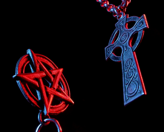
Both of them hang on the same necklace, which goes around the picture. It was a messy setup. The pentagram hangs off a thin metal string whose end is conceiled behind the black broder.
For those who didn't see how this meets the challenge (Strongly doubts there's anyone):
- Red vs Blue (Opposite ends of the spectrum)
- God vs Satan (Or vs Witchcraft, depending on how you look at the pentagram)
- Right side up vs Upside down
Statistics
Place: 47 out of 286 Avg (all users): 5.5765 Avg (commenters): 7.1500 Avg (participants): 5.4797 Avg (non-participants): 5.6413 Views since voting: 1454 Votes: 307 Comments: 24 Favorites: 0
Both the iconography and the angles of this shot capture my attention right from the start. Conceptually, this is among the best shots I've seen in this contest (opposites). I think the statement may have been more strongly served by baffling your lights such that no red fell on the cross, and no blue fell on the pentagram. The edging on the pentagram is faint enough to ignore, but the red edge on the cross is so noticeable as to confuse the sense of color involved in your statement.
very powerful image. nice detail. i like the colors, and lighting. great black background. i was thinking of a shot very similar to this, ended up going with something else. good work.
i love the it, the detail of each is great. i dislike the colors mixing up in the chains of the cross, its very messy. but thats my only critic. i love the angles!
opposites: yes, compelling: not so much. Lacks a strong "focal point", and neither icon is strong enough to really catch the eye on its own. Like the lighting, though. Especially the red/blue highlights.
This is great! I love how you picked the colors (red versus blue) and represented them accordingly. Very nice highlighting. The black background is pleasingly solid, though there's a bit too much of a black area above the pentagram (as compared to the area below the cross). If symmetry was your intention, probably would be better to move the pentagram up a bit. Then the negative space would be balanced. Just my two cents. Sharp and wonderfully done! :-)
The pentagram (pentacle) is not an evil symbol. Each point on the star represents something. Wicca uses the pentacle as their symbol and it's not evil. I do take offense because most people just assume its a symbol of the devil and satanic worship. A little reading up on the pentagram can tell you how treasured it is. Sighhh, movies have really desecrated it. Anyway, on to the technical aspects of the photo. I like the colors very much, the red and blue are saturated perfectly. I like how the cross reflects some red, and the pentacle reflects some blue. Not sure I like the crop too much. I'll have to come back to this one later in the challenge to comment more. *Ok* I'm back. After taking some time looking at the image again, I have decided I do like the crop. There is equal space between both symbols and the side of the image and also from top to bottom. I can't rate this low because I don't like how you used the pentacle. That is personal preference and not what the voting is about. So I will rate it just on the technical aspects. I've changed my vote and given you a 7.
Nice shot. Fits challenge well; I like the lighting and the composition. It may be hard for some viewers to take, but it really does justice to the challenge instructions. Good job.






 Add photograph to your favorites
 Add photographer to your favorites


