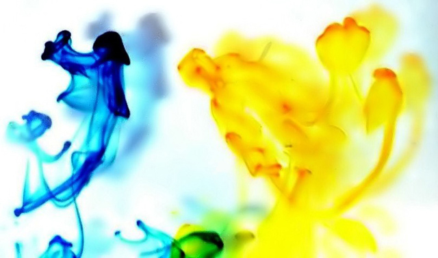
Interesting, nice high key - and would make a good image for the reception area of an office building. But dummy me, I just don't get much "opposite" - even tho the primary colors are complimentary on a color wheel.
I tried but couldn't see what's opposite here. If it's opposite colors on the color wheel, then I'm afraid I miss that boat because I don't know which colors are opposite. That said, the image doesn't hold too much visual interest for me.
This would be a great entry for "abstract", but I'm not sure I see the opposites theme here. Ah, blue and yellow...opposites on the color wheel, I suppose. Okay, up one rating for that!
OK, I know that yellow and blue are primary colors that together make green...but what exactly is the opposite concept in this shot? It is an interesting abstract, and I like the colors and shapes, but IMHO it doesn't meet the challenge.







 Add photograph to your favorites
 Add photographer to your favorites


 Photographer found comment helpful.


