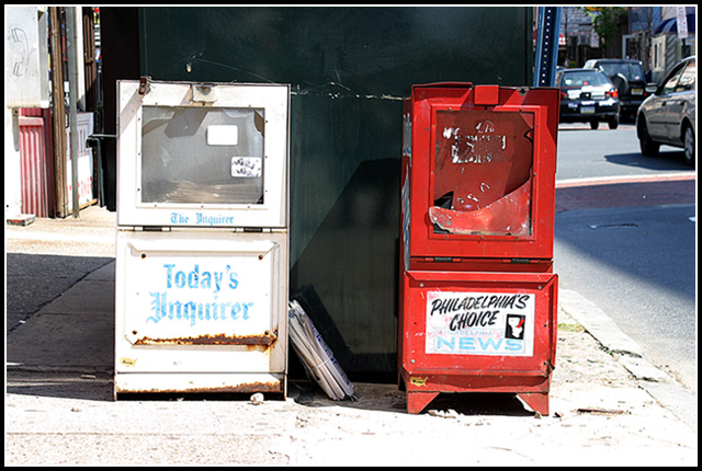
This comes accross more as opposing than opposites to me. Th shot has potential but the cropping seems a bit loose on the sides, I put my handy dandy trusty envelopes on the screen and took it in so it was just outside the sides of the stands and it made a huge difference in the shot, the distracting cars and store fronts were gone. Also if you played with the contrast and hues just a bit to really make the stands POP out, this shot has potential. As is a 3
Looks to be tilted 2 degrees clockwise and would benefit from tighter cropping to get rid of the distracting cars. Not sure what could be done about the sign post, but it's also out of place here.
Normally, I would like to see everything to the right of the right newstand cropped away. The subjects are so compelling to the eye, that the street does not detract, but rather helps locate the newsstand. Excellent shot.
Don't know for sure, but I think you meant this for the rusted challenge. If I'm wrong, I don't see the meaning. But for some reason, I do like the picture. A 3.





 Add photograph to your favorites
 Add photographer to your favorites


 Photographer found comment helpful.


