Thank you to all who appreciated my photo.
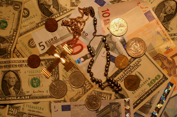
Actually my idea, not well expressed, was to show the opposition between the two big religion groups (christian and muslim) represented by the cross and the other one (it's not a rosary!).
Cannot see very well, but most coins (the dark ones on the lower part) are from lebanon and israel and the others (also the shining ones!) are us dollars, euro and pounds (can see very clear LOL). These represents the opposition between rich countries and "once-rich-now-poor" countries due to the wars.
(sorry I don't know yet how to update the comment in the box under the photo LOL@me)
The composition is interesting - the highlight on the coin overshadows the cross, which is too bad - it's the only religious element in the frame so it should be more of the focus of attention. The focus feels a little soft on the chain and cross as well.
Not a bad shot but the lighting is too yellow and the glare on the coin is very distracting. Also the contrast is really lacking in this shot. Not sure how the church and money are really opposite since most churches want your money, LOL! As is started at a 3 but going to bump to a 5
nice idea. i think the lighting is lacking something. maybe try either more shadowy, or more even lighting. the bright spot in upper right corner is a little distracting.
The shot seems a little dark. Perhaps if there was a little more light the vibrant colors of the money might have popped out a bit more. Good take on the challenge.
So why did I give this a 3 ?
Well, its 'flat' there is no depth, no texture, the lighting doesn't make the cross stand out, in fact it almost recedes into the notes. The orange 'tint' just reminds me of a tungsten white balance problem, The shiny coin takes too much attention because its the only shiny thing in the frame, and I guess its not supposed to be the main point of interest.
Sorry for the score, but I hope that helps to explain why I marked it doen.
faith and wealth .... not sure theyr'e opposites .... just ask your friendly TV evangelist.
i thought the photo could use a bit more brightness and contrast tweaking .... gotta love the counterfeit measures on the euro notes tho





 Add photograph to your favorites
 Add photographer to your favorites


 Photographer found comment helpful.


